January 14, 2023 by admin
Creating Beautiful Drop Caps in InDesign
Step 2
A trio of simple tweaks will help you to get the most out of your drop cap and give it a professionally polished look:
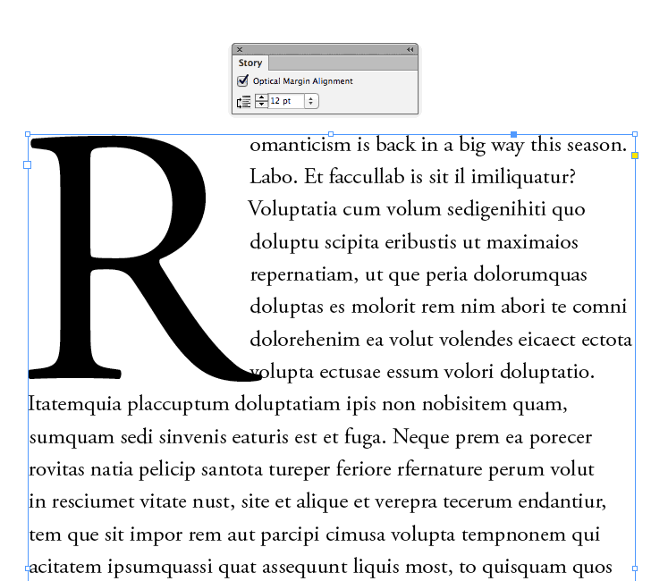
First, go to Window > Type & Tables > Story, and check the Optical Margin Alignment box. This shifts any straggly serifs or apostrophes to outside of the text frame, giving the whole paragraph, including your drop cap, a cleaner appearance.
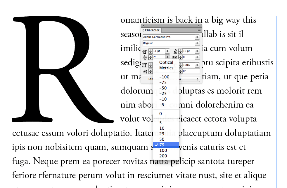
Is your drop cap crowding some of your paragraph text? Here, the tail of the ‘R’ is overlapping some of the body text. You can rectify this by placing your cursor between the drop cap letter and the first letter of the body text (here, between the ‘R’ and ‘o’ of ‘Romanticism’). Then, from either the Character Formatting Controls panel at the top of the screen or the Character panel (Window > Type & Tables > Character), increase the Kerning value, until the drop cap is separated sufficiently from the paragraph text.
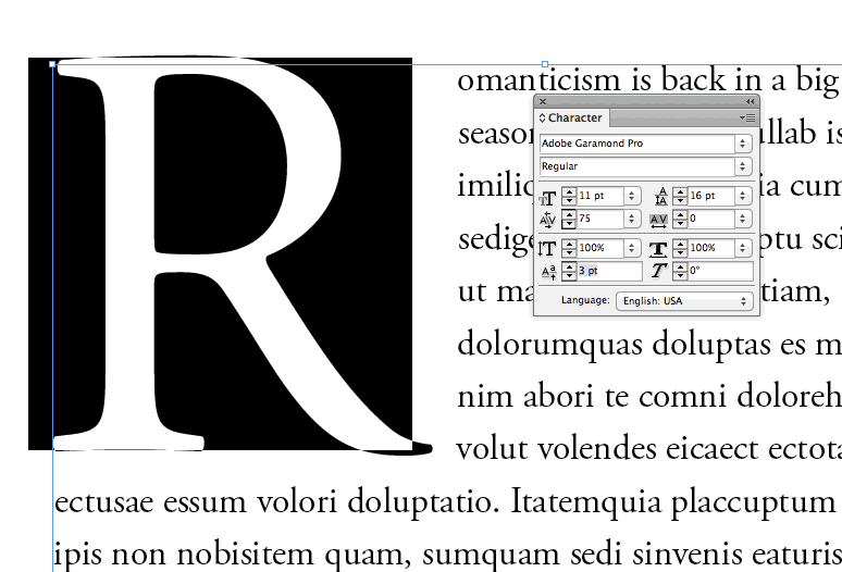
Finally, you can shift the baseline of the drop cap to allow it to be more nicely framed by the surrounding body text. Highlight the drop cap with your type cursor, and then increase the Baseline Shift from the bottom-left option in the Character panel.
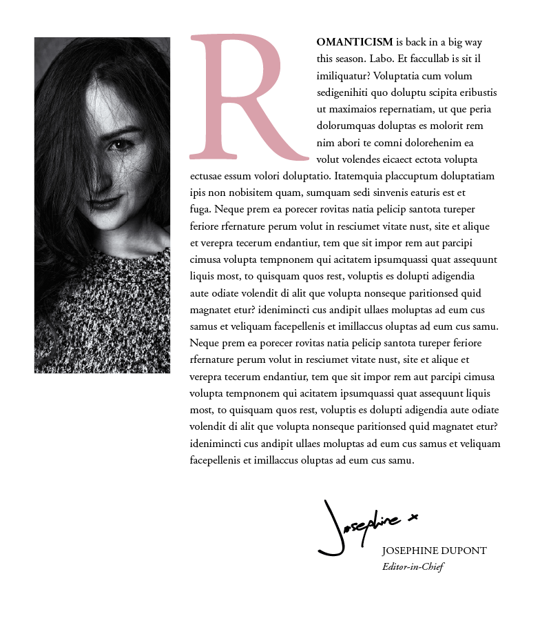
Try pulling out the drop cap in a contrasting color using the Swatches panel (Window > Color > Swatches) to add more drama to the effect.