January 30, 2024 by admin
HTML/CSS Reference for DMET 155/355
Display
A key trick to manipulating HTML elements is understanding that there’s nothing special about how most of them work. Most pages could be made up from just a few tags that can be styled any which way you choose. The browser’s default visual representation of most HTML elements consist of varying font styles, margins, padding and, essentially, display types.
The most fundamental types of display are inline, block and none and they can be manipulated with the display property and the shockingly surprising values inline, block and none.
Inline
inline does just what it says — boxes that are displayed inline follow the flow of a line. Anchor (links) and emphasis are examples of elements that are displayed inline by default.
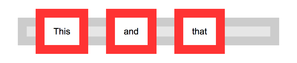
The following code, for example, will cause all list items in a list to appear next to each other in one continuous line rather than each one having its own line:
li { display: inline }
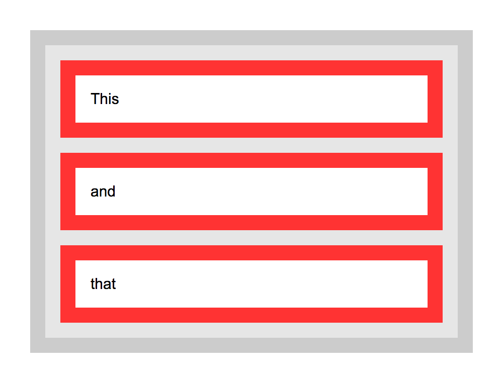
Block
block makes a box standalone, fitting the entire width of its containing box, with an effective line break before and after it. Block boxes allow greater height, margins, and padding manipulation than inline boxes. Heading and paragraph elements are examples of elements displayed this way by default in browsers.
The next example will make all links in “nav” large clickable blocks:
#navigation a {
    display: block;
    padding: 20px 10px;
}
display: inline-block will keep a box inline but lend the greater formatting flexibility of block boxes, allowing margin to the right and left of the box, for example.
None
none, doesn’t display a box at all, which may sound pretty useless but can be used to good effect with dynamic effects, such as switching extended information on and off at the click of a link, or in alternative stylesheets.
The following code, for example, could be used in a print stylesheet to basically “turn off” the display of elements such as navigation that would be useless in that situation:
#navigation, #related_links { display: none }
display: none and visibility: hidden vary in that display: none takes the element’s box completely out of play, whereas visibility: hidden keeps the box and its flow in place without visually representing its contents. For example, if the second paragraph of 3 were set to display: none, the first paragraph would run straight into the third whereas if it were set to visibility: hidden, there would be a gap where the paragraph should be.
See the Pen Block and Inline Block by Nicholas D’Angelo (@ndangelo) on CodePen.
See the Pen Block and inline boxes 3 by Nicholas D’Angelo (@ndangelo) on CodePen.
Page Layout
Layout with CSS is easy. You take a part of your page and put it wherever you choose. You can place these elements absolutely or relative to another element.
Positioning
The position property is used to define whether a box is absolute, relative, static or fixed:
staticis the default value and renders a box in the normal order of things, as they appear in the HTML.relativeis much likestaticbut the box can be offset from its original position with the propertiestop,right,bottomandleft.absolutepulls a box out of the normal flow of the HTML and delivers it to a world all of its own. In this crazy little world, the absolute box can be placed anywhere on the page usingtop,right,bottomandleft.fixedbehaves likeabsoluteBut it will position a box in reference to the browser window instead ofthe web page, so fixed boxes should stay exactly where they are on the screen even when the page is scrolled.
When we talk of absolutely positioned boxes being placed anywhere on the page, they’re still relatively positioned from the edges. And to add another backtrack, the page doesn’t actually have to be the container — a box will be “absolutely” positioned in relation to any non-static positioned containing box. Just ignore that for now, though…
Layout using absolute positioning
You can create a traditional two-column layout with absolute positioning if you have something like the following HTML:
<div id="navigation">
    <ul>
        <li><a href="this.html">This</a></li>
        <li><a href="that.html">That</a></li>
        <li><a href="theOther.html">The Other</a></li>
    </ul>
</div>

<div id="content">
    <h1>Ra ra banjo banjo</h1>
    <p>Welcome to the Ra ra banjo banjo page. Ra ra banjo banjo. Ra ra banjo banjo. Ra ra banjo banjo.</p>
    <p>(Ra ra banjo banjo)</p>
</div>
And if you apply the following CSS:
#navigation {
    position: absolute;
    top: 0;
    left: 0;
    width: 200px;
}

#content {
    margin-left: 200px;
}
You will see that this will set the navigation bar to the left and set the width to 200 pixels. Because the navigation is absolutely positioned, it has nothing to do with the flow of the rest of the page so all that is needed is to set the left margin of the content area to be equal to the width of the navigation bar.
#navigation {
    position: absolute;
    top: 0;
    left: 0;
    width: 200px;
}

#navigation2 {
    position: absolute;
    top: 0;
    right: 0;
    width: 200px;
}

#content {
    margin: 0 200px; /* setting top and bottom margin to 0 and right and left margin to 200px */
}
The only downside to absolutely positioned boxes is that because they live in a world of their own, there is no way of accurately determining where they end. If you were to use the examples above and all of your pages had small navigation bars and large content areas, you would be okay, but, especially when using relative values for widths and sizes, you often have to abandon any hope of placing anything, such as a footer, below these boxes. If you wanted to do such a thing, one way would be to float your chunks, rather than absolutely positioning them.
Floating
Floating a box will shift it to the right or left of a line, with surrounding content flowing around it.
Floating is normally used to shift around smaller chunks within a page, such as pushing a navigation link to the right of a container, but it can also be used with bigger chunks, such as navigation columns.
Using float, you can float: left or float: right.
Working with the same HTML, you could apply the following CSS:
#navigation {
    float: left;
    width: 200px;
}

#navigation2 {
    float: right;
    width: 200px;
}

#content {
    margin: 0 200px;
}
Then, if you do not want the next box to wrap around the floating objects, you can apply the clear property:
clear: leftwill clear left floated boxesclear: rightwill clear right floated boxesclear: bothwill clear both left and right floated boxes.
So if, for example, you wanted a footer in your page, you could add a chunk of HTML…
<div id="footer">
    <p>Footer! Hoorah!</p>
</div>
…and then add the following CSS:
#footer {
    clear: both;
}
And there you have it. A footer that will appear underneath all columns, regardless of the length of any of them.
This has been a general introduction to positioning and floating, with emphasis on the larger “chunks” of a page, but remember, these methods can be applied to any box within those boxes, too.
Specificity
If you have two (or more) conflicting CSS rules that point to the same element, there are some basic rules that a browser follows to determine which one is most specific and therefore wins out.
It may not seem like something that important, and in most cases you won’t come across any conflicts at all, but the larger and more complex your CSS files become, or the more CSS files you start to juggle with, the greater likelihood there is of conflicts arising.
More Specific = Greater Precedence
If the selectors are the same, the last one will always precede. For example, if you had:
p { color: red }
p { color: blue }
The text in the box of p elements would be colored blue because that rule came last.
However, you won’t usually have identical selectors with conflicting declarations on purpose (because there’s not much point). Conflicts quite legitimately come up, though, when you have nested selectors.
div p { color: red }
p { color: blue }
In this example it might seem that a p within a div would be colored blue, seeing as a rule to color p boxes blue comes last, but they would actually be colored red due to the specificity of the first selector. Basically, the more specific a selector, the more preference it will be given when it comes to conflicting styles.
Calculating Specificity
The actual specificity of a group of nested selectors takes some calculating. You can give every ID selector (“#whatever”) a value of 100, every class selector (“.whatever”) a value of 10 and every HTML selector (“whatever”) a value of 1. When you add them all up, hey presto, you have a specificity value.
phas a specificity of 1 (1 HTML selector)div phas a specificity of 2 (2 HTML selectors, 1+1).treehas a specificity of 10 (1 class selector)div p.treehas a specificity of 12 (2 HTML selectors + a class selector, 1+1+10)#baobabhas a specificity of 100 (1 id selector)body #content .alternative phas a specificity of 112 (HTML selector + id selector + class selector + HTML selector, 1+100+10+1)
So if all of these examples were used, div p.tree (with a specificity of 12) would win out over div p (with a specificity of 2) and body #content .alternative p would win out over all of them, regardless of the order.
From: https://www.htmldog.com/