January 30, 2024 by admin
HTML/CSS Reference for DMET 155/355
Media Queries
Media queries are used to target CSS at specific media types and media features. Styles can be applied to print or to screens of a certain size, for example.
Applying media queries
Media queries can be added to a link HTML element:
<link rel="stylesheet" href="this.css" media="print">
<!-- applies an external print-only stylesheet -->

<link rel="stylesheet" href="that.css" media="screen and (max-width: 800px)">
<!-- applies an external stylesheet to screens up to 800 pixels wide -->
Media queries can also be embedded in stylesheets using an @media rule:
@media print {
    body {
        font-family: "Times New Roman", Times, serif;
    }
    /* etc. */
}
/* applies styles to print only */

@media screen and (max-width: 800px) {
    body {
        padding: 0;
    }
    /* etc. */
}
/* applies styles to screens up to 800 pixels wide */
@import can also be used (@import url(this.css) print, for example).
Media types
screen and print are the most common media types. all can also be used and is the default state of a media query. Others, with patchy support, are braille, embossed, handheld, projection, speech, tty, and tv.
Media features
| Feature | Description | Possible values |
|---|---|---|
widthmin-widthmax-width | Display area width. | [length], eg. 800px |
heightmin-heightmax-height | Display area height. | [length], eg. 20em |
device-widthmin-device-widthmax-device-width | Screen width. | [length], eg. 2in |
device-heightmin-device-heightmax-device-height | Screen height. | [length], eg. 10cm |
orientation | Portrait (when height is greater than or equal to width) or landscape (when width is greater than height). | portraitlandscape |
aspect-ratiomin-aspect-ratiomax-aspect-ratio | The ratio of the value of width to the value of height. | [ratio], eg. 2/1 |
device-aspect-ratiomin-device-aspect-ratiomax-device-aspect-ratio | The ratio of the value of device-width to the value of device-height. | [ratio], eg. 16/9 |
colormin-colormax-color | The number of bits per color component of a screen. | [integer]0 indicates a device is not color.color without a value is the equivalent of min-color: 1 (device is color). |
color-indexmin-color-indexmax-color-index | The number of entries in a device’s color lookup table. | [integer]0 indicates a device does not use a color lookup table.color-index without a value is the equivalent of min-color-index: 1 (device uses a color lookup table). |
monochromemin-monochromemax-monochrome | The number of bits per pixel on a grayscale device. | [integer]0 indicates a device is not grayscale.monochrome without a value is the equivalent of min-monochrome: 1 (device is grayscale). |
resolutionmin-resolutionmax-resolution | A device’s pixel density. | [resolution], eg. 300dpi |
scan | Used with tv media type. The scanning process of a device. | progressiveinterlace |
grid | If a device is grid (such as a teletype-like terminal) or bitmap. | [integer]0 indicates a device is not grid.grid without a value is the equivalent of grid: 1 (device is grid). |
Media features and their values should be contained inside parentheses, such as (min-device-aspect-ratio: 16/9) or (color).
Combining media queries
Logical OR: comma-separated list
A comma-separated list will apply styles to multiple media queries.
@media screen, projection {
    /* CSS applied if device is screen OR projection */
}
Logical AND: and
The and keyword will combine media queries.
@media print and (min-resolution: 150dpi) {
    /* CSS applied if device is print AND resolution is at least 150dpi */
}
Logical NOT: not
The not keyword will exclude media queries.
@media not screen {
    /* CSS applied if device is NOT screen */
}
Pseudo Elements
Pseudo elements suck on to selectors much like pseudo classes, taking the form of selector:pseudoelement { property: value; }. There are four of the suckers.
First Letters and First Lines
The first-letter pseudo element applies to the first letter inside a box and first-line to the top-most displayed line in a box.
As an example, you could create drop caps and a bold first-line for paragraphs with something like this:
p {
    font-size: 12px;
}

p:first-letter {
    font-size: 24px;
    float: left;
}

p:first-line {
    font-weight: bold;
}
The CSS 3 specs suggest pseudo elements should include two colons, so p::first-line as opposed to p:first-line. This is to differentiate them with pseudo classes. Aiming for backwards-compatibility (whereby older web pages will still work in new browsers), browsers will still behave if they come across the single colon approach and this remains the best approach in most circumstances due to some older browsers not recognizing the double colon.
Before and After Content
The before and after pseudo elements are used in conjunction with the content property to place content either side of a box without touching the HTML.
What?! Content in my CSS?! But I thought HTML was for content!
Well, it is. So use sparingly. Look at it like this: You are borrowing content to use solely as presentation, such as using “!” because it looks pretty. Not because you actually want to exclaim anything.
The value of the content property can be open-quote, close-quote, any string enclosed in quotation marks, or any image, using url(imagename).
blockquote:before {
    content: open-quote;
}

blockquote:after {
    content: close-quote;
}

li:before {
    content: "POW! ";
}

p:before {
    content: url(images/jam.jpg);
}
The content property effectively creates another box to play with so you can also add styles to the “presentational content”:
li:before {
    content: "POW! ";
    background: red;
    color: #fc0;
}
End of Intermediate CSS Tutorial
From: https://www.htmldog.com/
Code Snippets
<script src="https://ajax.googleapis.com/ajax/libs/jquery/2.1.1/jquery.min.js"></script>
<script src="https://google-code-prettify.googlecode.com/svn/loader/run_prettify.js"></script>

<script>
  $(function() {
    $("a[href*=#]:not([href=#])").click(function() {
      if (
        location.pathname.replace(/^//, "") ==
        this.pathname.replace(/^//, "") &&
        location.hostname == this.hostname
      ) {
        var target = $(this.hash);
        target = target.length ? target : $("[name=" + this.hash.slice(1) + "]");
        if (target.length) {
          $("html,body").animate({
              scrollTop: target.offset().top
            },
            1000
          );
          return false;
        }
      }
    });
  });
</script>
Inertia Anchor Link Code:
End of Intermediate Tutorial
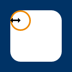
Rounded Corners
Rounded corners used to be the stuff of constricting solid background images or, for flexible boxes, numerous background images, one per-corner, slapped on multiple nested div elements. Argh, ugly. Well, not any longer. Now, with simple CSS, you can lavish your designs with more curves than Marilyn Monroe.
Border radius?
Yeah. Border radius. Fear not, though — you don’t have to have borders. The border-radius property can be used to add a corner to each corner of a box.
#marilyn {
    background: #fff;
    width: 100px;
    height: 100px;
    border-radius: 20px;
}
And there you have it. Rounded corners, see? Well, you will if you’ve got a sensible browser (see note below).
Of course, if you do want a border…
#ok_a_border_then {
    border: 5px solid #8b2;
    width: 100px;
    height: 100px;
    border-radius: 5px;
}
Multiple values
border-top-left-radius, border-top-right-radius, border-bottom-right-radius, and border-bottom-left-radius can also be used to target specific corners.
Ever so slightly less horribly wordy, you can also define all corner radii (what a great word) individually with a space-separated list of values, working clockwise from top-left, just like other shorthand properties:
#monroe {
    background: #fff;
    width: 100px;
    height: 100px;
    border-radius: 6px 12px 18px 24px;
}

By using two values instead of four you target top-left and bottom-right with the first length (or percentage) and top-right + bottom-left with the second. Three values? Top-left, then top-right + bottom-left, then bottom-right.
Ellipses
Are circles a bit too square for you? You can specify different horizontal and vertical radiiii by splitting values with a “/”.
#nanoo {
        background: #fff;
        width: 100px;
        height: 150px;
        border-radius: 50px/100px;
        border-bottom-left-radius: 50px;
        border-bottom-right-radius: 50px;
}

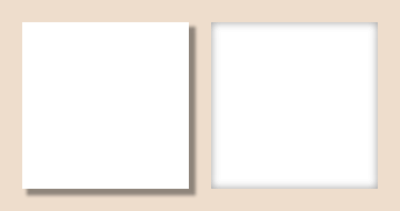
Shadows
You can make parts of your page “pop” by applying shadows to boxes and text.
Box Shadows
box-shadow is the standard CSS property to get you going and it can have a value comprising several parts:
box-shadow: 5px 5px 3px 1px #999
- The first value is the horizontal offset — how far the shadow is nudged to the right (or left if it’s negative)
- The second value is the vertical offset — how far the shadow is nudged downwards (or upwards if it’s negative)
- The third value is the blur radius — the higher the value the less sharp the shadow. (“0” being absolutely sharp). This is optional — omitting it is equivalent of setting “0”.
- The fourth value is the spread distance — the higher the value, the larger the shadow (“0” being the inherited size of the box). This is also optional — omitting it is equivalent of setting “0”.
- The fifth value is a color. That’s optional, too.
Inner shadows
You can also apply shadows to the inside of a box by adding “inset” to the list:
box-shadow: inset 0 0 7px 5px #ddd;
Text Shadows
box-shadow, as its name implies, only has eyes for boxes. Fickle beast. But you can also apply shadows to the outline of text with text-shadow:
text-shadow: -2px 2px 2px #999;
Similarly to box-shadow:
- The first value is the horizontal offset
- The second value is the vertical offset
- The third value is the blur radius (optional)
- The fourth value is the color (optional, although omitting this will make the shadow the same color as the text itself)
Note that there is no spread distance or inset option for text-shadow.
text-shadow has taken a little bit longer for browsers to figure out. Internet Explorer 9 and below won’t understand it so we suggest only using it in non-critical situations.
Universal, Child, and Adjacent Selectors
In earlier tutorials, we have covered HTML selectors, Class and ID selectors, and how to combine selectors to target specific element boxes. Using three itty-bitty characters, you can further pinpoint an element, reducing the need to bloat your HTML with class and ID attributes.
Universal selectors
Using an asterisk (“ * ”), you can target everything. You can use it by itself to set global styles for a page, or as a descendant of a selector to set styles of everything within something.
The following, for example, will set the margin and padding on everything in a page to zero and everything within an element with the ID “contact” to be displayed as a block:
* {
    margin: 0;
    padding: 0;
}

#contact * {
    display: block;
}
Using a standalone universal selector is commonly used to “reset” many of a browser’s default styles. Setting a margin to zero, for example, will kill all spacing around paragraphs, headings and blockquotes.
Child selectors
A greater-than symbol (“>”) can be used to specify something that is a child of something else, that is, something immediately nested within something.
So, with this HTML…
<ul id="genus_examples">
    <li>Cats
        <ul>
            <li>Panthera</li>
            <li>Felis</li>
            <li>Neofelis</li>
        </ul>
    </li>
    <li>Apes
        <ul>
            <li>Pongo</li>
            <li>Pan</li>
            <li>Homo</li>
        </ul>
    </li>
</ul>
…and the following CSS…
#genus_examples > li { border: 1px solid red }
…a red border would be drawn around “Cats” and “Apes” only, rather than around every single list item (which would be the case with #genus_examples li { border: 1px solid red }). This is because the likes of “Panthera” and “Felis” are grandchildren of “genus_examples”, not children.
Adjacent selectors
A plus sign (“+”) is used to target an adjacent sibling of an element, essentially, something immediately following something.
With the following HTML:
<h1>Clouded leopards</h1>
<p>Clouded leopards are cats that belong to the genus Neofelis.</p>
<p>There are two extant species: Neofelis nebulosa and Neofelis diardi.</p>
…and CSS…
h1 + p { font-weight: bold }
Only the first paragraph, that follows the heading, will be bolded.
A further, CSS 3, “general sibling” selector uses a tilde (“~”) and will match an element following another regardless of its immediacy. So, in the above example, h1 ~ p { font-weight: bold } will style all paragraphs after the top-level heading but if there were any ps preceding the h1, these would not be affected.
Advanced Colors
We already know that colors can be defined by name, RGB, or hex values, but CSS 3 also allows you to paint away with HSL — hue, saturation, and lightness — as well as stipulating transparency.
There are no super special properties at play here — HSL and RGBa (the “a” standing for “alpha”, as in “alpha transparency”) can be applied to any property that has a color value, such as color, background-color, border-color or box-shadow, to name a mere handful.
Alpha transparency
RGBa opens up an exciting new dimension to web design, allowing you to set the transparency of a box or text. If you wanted a smidgen of a snazzy background image to peep through a heading, for example, you might use something like this:
h1 {
    padding: 50px;
    background-image: url(snazzy.jpg);
    color: rgba(0,0,0,0.8);
}
A standard value of rgb(0,0,0) would set the heading to pure black but that fourth value, in rgba, sets the level of transparency, “1” being completely opaque, “0” being completely transparent. So rgba(0,0,0,0.8) is saying red=“0”, green=“0”, blue=“0”, alpha=“0.8”, which, all together, makes it 80% black.
This doesn’t only apply to text, of course, you could apply a transparent background color to an entire box, a transparent box shadow… anywhere where you can use rgb, you can used rgba.
Hue, saturation, and lightness
Color names aside, web colors have always been red-green-blue biased, be that through hex codes or explicit RBG (or RGBa). Although mildly less straightforward (especially if your brain is trained to break down colors into red, green and blue), HSL can actually be more intuitive because it gives you direct control over the aspects of a color’s shade rather than its logical ingredients.
It is used in a similar way to rgb:
#smut { color: hsl(36, 100%, 50%) }
Rather than each sub-value being a part of the color spectrum, however, they are:
- Hue (“36” in the above example): Any angle, from 0 to 360, taken from a typical color wheel, where “0” (and “360”) is red, “120” is green and “240” is blue.
- Saturation (“100%” in the example): How saturated you want the color to be, from 0% (none, so a level of grey depending on the lightness) to 100% (the whole whack, please).
- Lightness (“50%” in the example): From 0% (black) to 100% (white), 50% being “normal”.
So the example used here will produce an orange (36°) that is rich (100% saturation) and vibrant (50% lightness). It is the equivalent of #ff9900, #f90, and rgb(255, 153, 0).
HSLa
Hey, man, this funky fresh transparency and HSL can be combined?! You’d better believe it. Here’s HSLa:
#rabbit { background: hsla(0, 75%, 75%, 0.5) }
hsl and hsla are supported by most modern browsers, including IE versions 9 and above.
At-Rules: @import, @media, and @font-face
At-rules encapsulate a bunch of CSS rules and apply them to something specific. They can be used to import other CSS files, apply CSS to a particular media, or embeduncommon fonts.
Each at-rule starts with an apetail, or an “at sign”, if you want to be boring about it (“@”).
Importing
Let’s start with the simple @import rule. This is used to bolt another stylesheet onto your existing one.
@import url(morestyles.css);
This can be used if a site requires long, complex stylesheets that might be easier to manage if they are broken down into smaller files.
@import rules must be placed at the top of a stylesheet, before any other rules.
Targeting media types
@media can be used to apply styles to a specific media, such as print.
@media print {
    body {
        font-size: 10pt;
        font-family: times, serif;
    }

    #navigation {
        display: none;
    }
}
Values that follow “@media” can include screen, print, projection, handheld, and all, or a comma-separated list of more than one, such as:
@media screen, projection {
    /* ... */
}
It doesn’t stop there, oh no. CSS 3 allows you to target not only specific media but also variables relating to that media, such as screen size (particularly helpful in targeting phones).
Embedding fonts
@font-face has been around for a long time but was nigh-on useless for much of its life. CSS 3 has polished it up and it is now widely used as a technique for embedding fonts in a web page so that a typeface can be used even if it isn’t sitting on the user’s computer. So you no longer need to rely on “web safe” fonts such as Arial or Verdana. Exciting times.
@font-face {
    font-family: "font of all knowledge";
    src: url(fontofallknowledge.woff);
}
What this does is create a font named “font of all knowledge” using the font-family descriptor and links the font file “fontofallknowledge.woff” to that name using the src descriptor. “font of all knowledge” can then be used in a standard font rule, such as:
p { font-family: "font of all knowledge", arial, sans-serif; }
The font will be downloaded (in this case from the same directory as the CSS file) and applied to paragraphs. If the browser is too decrepit to deal with sparkly new font-faces, it will simply revert to the next, standard, font in the list.
You can also look for a number of fonts to apply to the rule with a comma-separated list. Checking to see if a font is already present on a user’s computer, removing the need to download it, can also be accomplished by replacing “url” in the src value with “local”.
And because a font file might contain a whole host of weights or styles, you might also want to specify which one you’re interested in. So the @font-face rule could end up looking something like this:
@font-face {
    font-family: "font of all knowledge";
    src: local("font of all knowledge"), local(fontofallknowledge), url(fontofallknowledge.woff);
    font-weight: 400;
    font-style: normal;
}
Legally speaking, you can’t just throw any old font you feel like up on the Interweb because there are copyright and usage terms to consider, not to mention compatibility and optimization issues.
There are free web fonts out there that you can find, download, upload, and use, though. Hell, you could even create one yourself if you’re mad-scientist clever. There are also web font providers, such as Adobe’s Typekit, that have a large selection of fonts to choose from at a price.
Google Web Fonts has a more limited selection but it’s free to use and makes things super, super (super, super, super) easy. All you need to do is link to one of their external CSS files, which is nothing more than a @font-face rule, and whammo — you’ve got a darling new font to play with.
Attribute Selectors
What? More selectors? Because someone somewhere really wants you to keep your HTML as tidy as possible. So before you add a class attribute to a tag see if you can target it by an attribute that might already be there.
Attribute selectors allow you to style an element’s box based on the presence of an HTML attribute or of an attribute’s value.
With the attribute…
Appending an attribute name enclosed in square brackets, to style something that contains a certain attribute, you can do something like this:
abbr[title] { border-bottom: 1px dotted #ccc }
This basically says “shove a dotted line underneath all abbreviations with a title attribute”.
With the attribute and its value…
You can further specify that you want to style something with a specific attribute value.
input[type=text] { width: 200px; }
This example will apply a width of 200 pixels only to input elements that are specified as being text boxes (<input type="text">).
This approach can certainly be useful in forms where input elements can take on many guises using the type attribute.
You can also target more than one attribute at a time in a way similar to the following:
input[type=text][disabled] { border: 1px solid #ccc }
This will only apply a gray border to text inputs that are disabled.
CSS 3 further allows you to match an attribute without being exact:
[attribute^=something]will match a the value of an attribute that begins with something.[attribute$=something]will match a the value of an attribute that ends with something.[attribute*=something]will match a the value of an attribute that contains something, be it in the beginning, middle, or end.
So, as an example, you could style external links (eg. “http://www.htmldog.com”) differently to internal links (eg. “overhere.html”) in the following way:
a[href^=http] {
    padding-right: 10px;
    background: url(arrow.png) right no-repeat;
}
CSS Transitions
Transitions allow you to easily animate parts of your design without the need for the likes of JavaScript. How dangerous.
At the most simplistic level, think of a traditional :hover state, where you might change the appearance of a link when a cursor fondles it:
a:link {
    color: hsl(36,50%,50%);
}
a:hover {
    color: hsl(36,100%,50%);
}
This creates a binary animation; a link switches from a subdued orange to a rich orange when it is hovered over.
The transition property, however, is much more powerful, allowing smooth animation (rather than a jump from one state to another). It is a shorthand property that combines the following properties (which can be used individually if you so choose):
transition-property: which property (or properties) will transition.transition-duration: how long the transition takes.transition-timing-function: if the transition takes place at a constant speed or if it accelerates and decelerates.transition-delay: how long to wait until the transition takes place.
Returning to the shorthand property, if a transition is applied like so…
a:link {
    transition: all .5s linear 0;
    color: hsl(36,50%,50%);
}
a:hover {
    color: hsl(36,100%,50%);
}
…when the link is hovered over, the color will gradually change rather than suddenly switch. The transition property here is saying it wants all properties transitioned over half a second in a linear fashion with no delay.
For a transition to take place, only transition-duration is required, the rest defaulting to transition-property: all; transition-timing-function: ease; transition-delay: 0;. So you could, for example, simply declare transition: .5s.
Targeting specific properties
While “all” can be used in transition-property (or transition), you can tell a browser only to transition certain properties, by simply plonking in the property name you want to change. So the previous example could actually include transition: color .5s ease 0, given only the color changes.
If you want to target more than one property (without using “all”), you can offer up a comma-separated list with transition-property:
a:link {
    transition: .5s;
    transition-property: color, font-size;
...
Or you can offer up a slew of rules for transitioning each property like so:
a:link {
    transition: color .5s, font-size 2s;
...
Easing
OK, so transition-timing-function. is the least obvious fella. It effectively states how the browser should deal with the intermediate states of the transition.
It follows a cubic Bézier curve. Yeah. Obviously, we know all about them from infant school, but, to get down to it, at the most basic level you can use ease or linear.
ease produces a gradual acceleration at the start of the transition and a gradual deceleration at the end. linear maintains a constant speed throughout. Other values include ease-in and ease-out.
CSS transitions won’t work in Internet Explorer versions 9 and below. Booo. But that won’t matter in cases (which will be most cases) where transitions aren’t essential for a design to work well. It’s just a little something to keep in mind.
CSS Backgrounds: Multiples, Size, and Origin
As well as plastering a single or tiling background image across parts of your page, you can also apply multiple backgrounds, adjust the size of background images, and define the origin of a background based on levels of the box model.
Multiple backgrounds
CSS3 allows you to apply multiple background images to a single box by simply putting image locations in a comma-separated list:
background-image: url(this.jpg), url(that.gif), url(theother.png);
More usefully, you can also define all of the other delightful background aspects. If you wanted to style a chunky button-like link with separate background, bullet, and arrow, for example, you could use something like:
background: url(bg.png), url(bullet.png) 0 50% no-repeat, url(arrow.png) right no-repeat;
Easy, right? It’s just the same as using background-image, background-position, background-repeat, background-attachment, and background, except you can specify more than one background with the aid of that helpful little comma.
Background size
The background-size property allows you to stretch or compress a background image.

background-size: contain and background-size: coverThe values can be:
auto, which maintains the background image’s original size and width/height ratio.- lengths, a width and a height, such as
100px 50px(100px wide, 50px high). Specifying a single length, such as100pxwill result the equivalent of100px auto. - percentages, a width and a height, such as
50% 25%(50% of the width of the background area, 25% of the height of the background area). Specifying a single percentage, such as50%will result the equivalent of50% auto. - A combination of lengths, percentages, and
auto, such as80px auto(80px wide, automatic height to maintain the image’s original ratio) contain, which maintains the background image’s original ratio and makes it as large as possible whilst fitting entirely within the box’s background area.cover, which maintains the background image’s original ratio and makes it large enough to fill the entire background area, which may result in either the height or width cropping.
Background Origin
background-origin is the remarkably dull kid of the bunch. Not unintelligent, just dull. The kid that the other kids point and laugh at. The property defines where the background area of a box actually starts. If you think of the box model, when you set a background it should, by default, start from the upper-left corner of the padding box. So if you had…
#burrito {
    width: 400px;
    height: 200px;
    border: 10px solid rgba(0,255,0,.5);
    padding: 20px;
    background: url(chilli.png) 0 0 no-repeat;
}
…the background image should appear in the top left corner, in the padding box, immediately after the inner edges of a green border. You can change this behavior, however, with background-origin. Its self-descriptive values can be padding-box (default, as described above), border-box, and content-box.
So adding background-origin: border-box to the previous example will cause the origin of the background image to be tucked up inside the border.
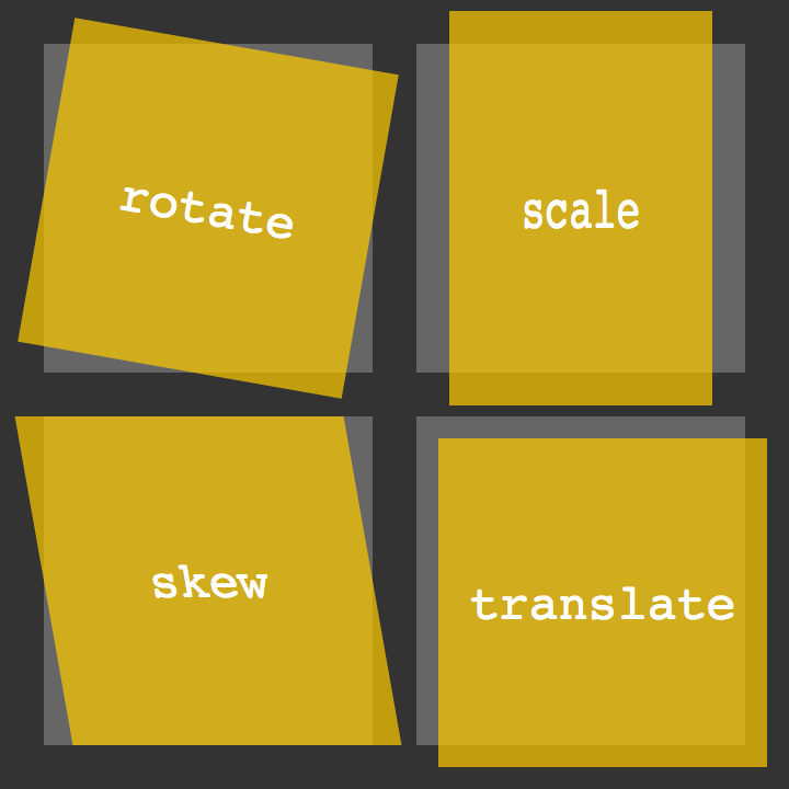
Transformations
By default, CSS boxes, those visual representations of HTML elements, are so square. Rectangular, at least; level, with four straight sides and four boring right angles. But with the use of transform you can stretch and mold those boxes into all manner of shapes.
This page will only mention the transform and transform-origin properties but, in practice, you will probably want to duplicate these with -webkit-transform and -webkit-transform-origin to achieve the same results in the likes of Safari and Chrome as well as -ms-transform and -ms-transform-origin for Internet Explorer 9, which is the earliest version of IE that will support transforms.
Manipulating a box over two dimensions, transform can be used to rotate, skew, scale and translate a box and its contents.
Rotating
The following would result in a square orange box with all of its contents — text, images, whatever — obediently standing to attention:
.note {
    width: 300px;
    height: 300px;
    background: hsl(36,100%,50%);
}
But you can spin those soldiers around by adding a further declaration:
transform: rotate(-10deg);
This will turn the box and, importantly, everything in it, ten degrees anti-clockwise.
Skewing
Skewing allows you to tip the horizontal and vertical so the following…
transform: skew(20deg,10deg);
…will tip over the x-axis by 20 degrees on the y-axis by 10 degrees.
You can also specify one angle, such as skew(20deg), which is the equivalent of skew(20deg,0).
Scaling
Obviously, you can change width and height properties on a box, but that won’t affect the size of anything inside it. Scaling, however, will multiply not only the width and height, but the size of everything contained in the box as well:
transform: scale(2);
This will multiply the size by two. You can use any positive number, including a value less than “1”, such as “0.5”, if you want to use a shrink ray.
You can also scale the horizontal and vertical dimensions separately:
transform: scale(1,2);
This will leave the horizontal as is (because it’s a scale of 1) and multiply the vertical by two.
Translating
You can shift a box horizontally and vertically using transform: translate:
transform: translate(100px,200px);
Similar to position: relative; left: 100px; top: 200px;, this will move a box 100 pixels to the right and 200 pixels down.
As well as the values mentioned, if you want to target an individual axis, you can also use skewX, skewY, scaleX, scaleY, translateX, and translateY.
Combining transformations
Want to rotate and scale at the same time? You crazy kid. You can do this by simply separating values with spaces, such as:
transform: rotate(-10deg) scale(2);
The order of the values is important – the latter will be executed before the former. In the previous example, the box will be scaled and then rotated. It is, therefore, different to transform: scale(2) rotate(-10deg);, which will be rotated and then scaled.
Alternatively, you could use the matrix function. matrix does the whole lot – rotating, skewing, scaling, and translating. It takes six values:
transform: matrix(2,-0.35,0.35,2,0,0);
These values aren’t entirely straightforward and involve maths (or just one math if you’re of the American persuasion) that, if you really want to tackle (there are benefits not only in brevity but also in precision), it may be worth giving the specs a gander.
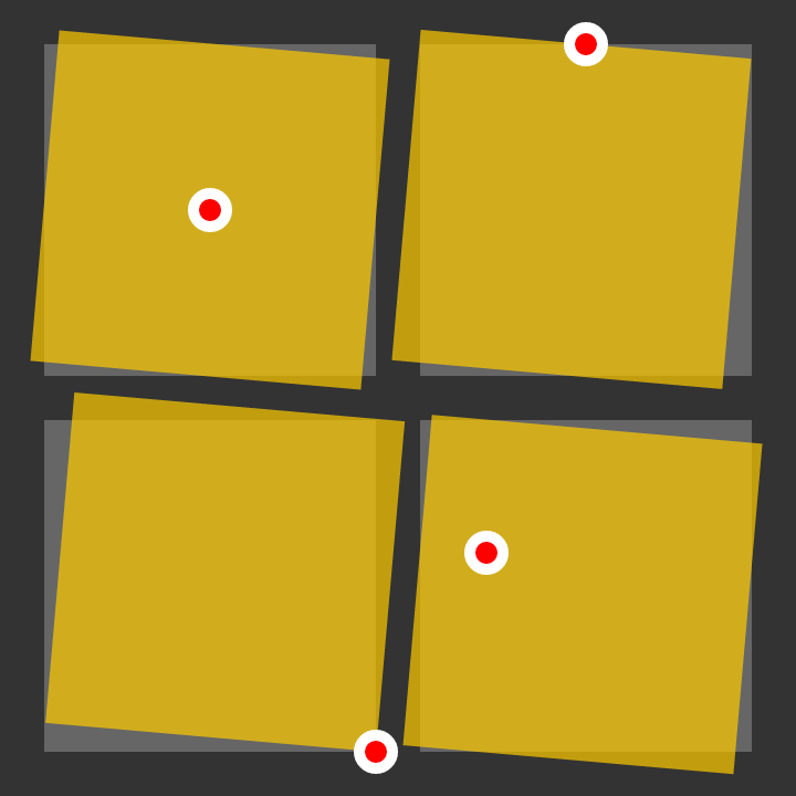
Origin
There’s one important aspect missing. If you are transforming a box, a further parameter is involved: the transformation’s origin. If you are rotating, for example, it will, by default, turn on the point that is the center of the box; if you had a piece of card, stuck a pin right through the middle of it, and then stuck that to your forehead (don’t do this), the card would spin from the middle. You can change where in the card the pin is stuck with transform-origin, however:
transform-origin: 0 0;
This example will tell the box to transform (rotate, in the previous example) from the top left, the first “0” being horizontal, the second being vertical. These values could be different, of course — like all other x-y, and you can use the usual center, top, right, bottom, left, length and percentage values, including negatives.
And all of that’s just with two dimensions. transform is a leviathan with even greater power that can also be used for three-dimensional magic. On the most basic level, you can use rotateX and rotateY, which will rotate “towards” or “away” from you on the x- and y-axis, and there are the likes of translate3d, scale3d, and the intimidating matrix3d, all of which have even greater browser difficulties than their 2D counterparts.