January 30, 2024 by admin
HTML/CSS Reference for DMET 155/355
Gradients
Images showing a smooth dissolve from one color to another are plastered all over the web. However, CSS 3 allows you to place them in your designs without creating an actual image file.
There is no special property for this; you use the background or background-image property and define your gradient in its value. You can create both linear and radial gradients this way.
Linear gradients
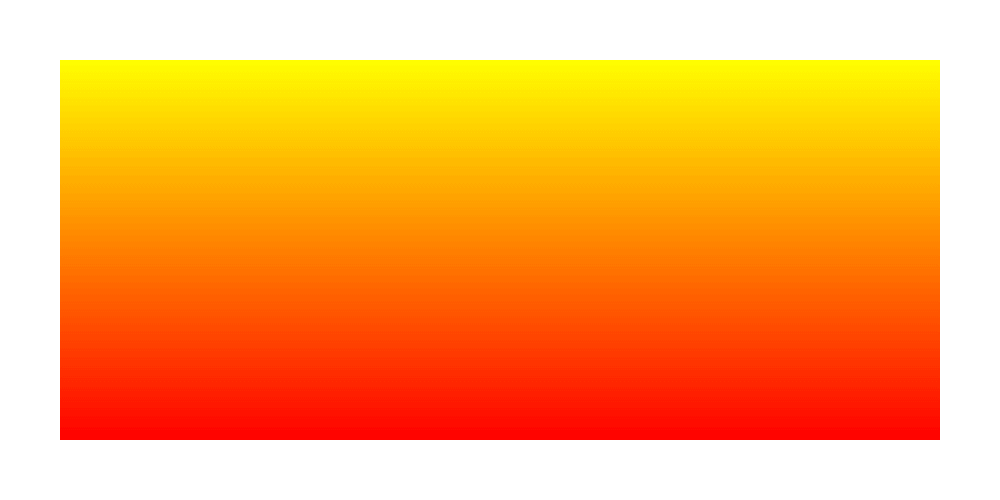
For an even spread of two colors, fading from one at the top to another at the bottom, a declaration can be something like:
background: linear-gradient(yellow, red);
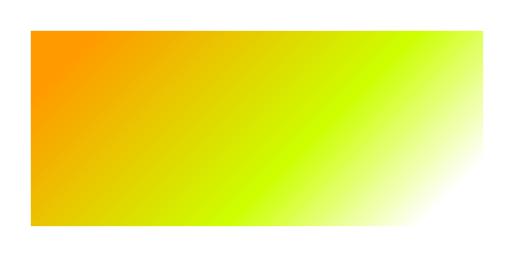
To manipulate the angle of the fading, you slot in “to” and the destination you want the transition to head to. You can head to one side:
background: linear-gradient(to right, orange, red);
Or one corner:
background: linear-gradient(to bottom right, orange, red);
Or any angle that tickles your fancy:
background: linear-gradient(20deg, orange, red);
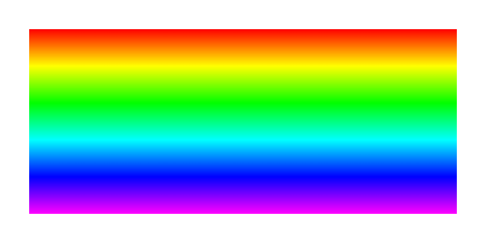
And why stop at two colors? Specify as many as you dare:
background: linear-gradient(hsl(0,100%,50%),hsl(60,100%,50%),hsl(120,100%,50%),hsl(180,100%,50%),hsl(240,100%,50%),hsl(300,100%,50%));
To get gradients to work on as many browsers as possible, you will probably also want to use -webkit-linear-gradient to cover Safari and older versions of Chrome. The values of these must also exclude the “to” part, if used.
CSS gradients won’t play at all with IE 9 and below, but you can still make them, and any other incapable browser, use the traditional method of a good old fashioned image by specifying that first, as a fallback (proceeding declarations will just be ignored).
So, all-in, your gradients might look something like this:
body {
    background: #666 url(fade.png) 0 0 repeat-y;
    background: -webkit-linear-gradient(right, #000, #666);
    background: linear-gradient(to right, #000, #666);
}
See the Pen Linear Gradient by Nicholas D’Angelo (@ndangelo) on CodePen.
Radial gradients
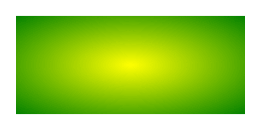
Radial gradients, with one color starting from a central point and fading to another color, use a similar syntax:
background: radial-gradient(yellow, green);
You can also specify the shape of the fade. By default it is an ellipse, spreading to fill the background box, but you can force it to be circular, regardless of the shape of the box:
background: radial-gradient(circle, yellow, green);

Using “closest-side”, “closest-corner”, “farthest-side” and “farthest-corner” you can also specify if the gradient is contained by the sides or corners of the box nearest to or furthest away from the origin:
background: radial-gradient(circle closest-side, yellow, green);
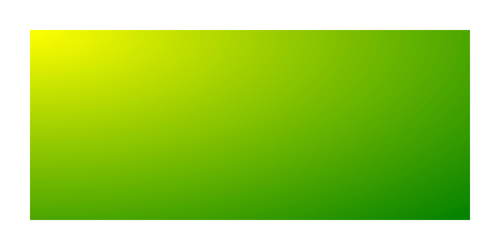
And if you wanted to place the origin of the gradient somewhere specific, you can also use “at”:
background: radial-gradient(at top left, yellow, green);
See the Pen Radial Gradient by Nicholas D’Angelo (@ndangelo) on CodePen.
More compatibility notes: additional -webkit-radial-gradient usage is wise. The order of the parameters needs to be changed here, and, like “to”, “at” is excluded. So:
background: radial-gradient(circle closest-side at 100px 200px , black, white);
Would be accompanied by:
background: -webkit-radial-gradient(100px 200px, circle closest-side, black, white);
Color stops
If you don’t want a uniform blend across your gradient, you can specify exactly where in the gradient each color kicks in, straight after each color, starting at “0” and ending at “100%” (although lengths can also be used).
linear-gradient(black 0, white 100%)is the equivalent oflinear-gradient(black, white)radial-gradient(#06c 0, #fc0 50%, #039 100%)is the same asradial-gradient(#06c, #fc0, #039)linear-gradient(red 0%, green 33.3%, blue 66.7%, black 100%)will have the same result aslinear-gradient(red, green, blue, black)
That’s because, when the positions are stated in these examples, they evenly space out the colors, which is the default when no color stops are explicitly defined.
So, to get on with that tinkering, you can pull and stretch away with those stops:
background: linear-gradient(135deg, hsl(36,100%,50%) 10%, hsl(72,100%,50%) 60%, white 90%);
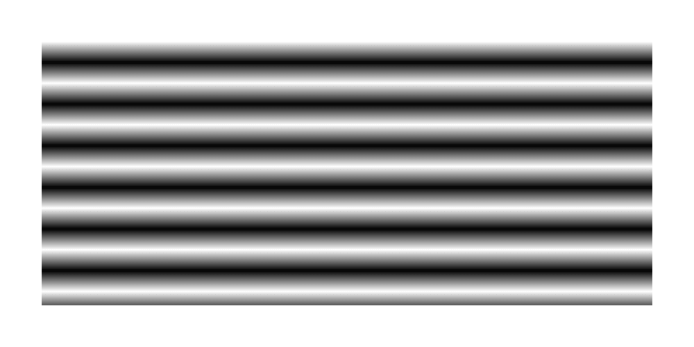
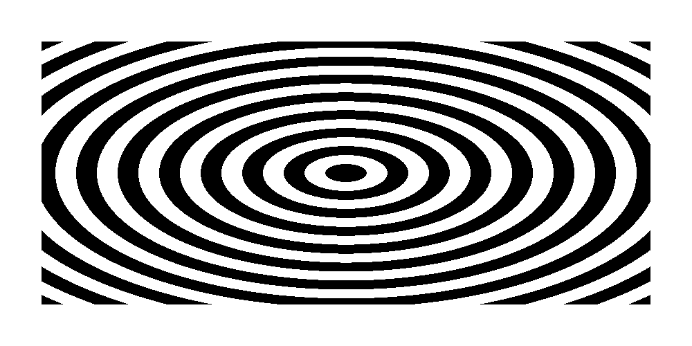
Repeating gradients
A single gradient will fill a box with the previous methods but you can use “repeating-linear-gradient” and “repeating-linear-gradient” to build on the color stops and, repeat the gradient.
For basic bars of black-and-white bars, for example:
background: repeating-linear-gradient(white, black 15px, white 30px);
Or something a bit more solid:
background: repeating-radial-gradient(black, black 15px, white 15px, white 30px);
Assignment
- Create your an example of the following:
- 5 Examples of a Linear Gradient (in a div): Use 2 with two colors and 3 with multiple colors using HSL colors.
- Create two unique Radial Gradients
- Create a two circular radial gradient
- Create a gradient that includes a color stop and all the other examples shown above ie: at top left etc
- Vary the positioning of the gradient (top-right, top-left etc…)
- create a linear gradient using HSL color. Use at least 6 colors. https://www.quackit.com/css/color/charts/hsl_color_chart.cfm
- Unrelated best practice! Include: <meta name=”viewport” content=”width=device-width, initial-scale=1.0″> within the head tags in your HTML. This will help make sure that your web pages are always mobile-compliant. (We will still need other CSS to make that happen.)