February 19, 2018
Complete Guide to Typography – Poster: Supplimentary
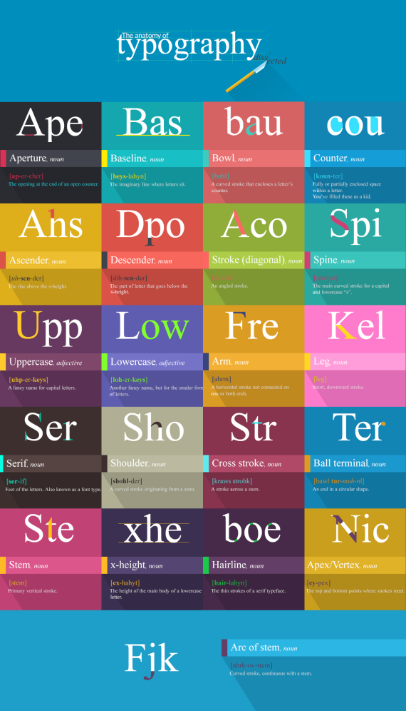
1. Aperture
The opening at the end of an open counter.
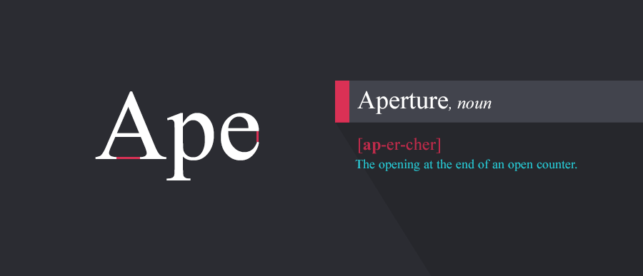
2. Baseline
As the legendary Les Claypool puts it – “the baseline is the line upon which most letters “sit” and below which descenders extend. The vertical distance of the baselines of consecutive lines in a paragraph is also known as line height or leading, although the latter can also refer to the baseline distance minus the font size.
North Indian scripts have a characteristic hanging baseline; the letters are aligned to the top of the writing line, marked by an overbar, with diacritics extending above the baseline. East Asian scripts have no baseline; each glyph sits in a square box, with neither ascenders nor descenders. When mixed with scripts with a low baseline, East Asian characters should be set so that the bottom of the character is between the baseline and the descender height. “
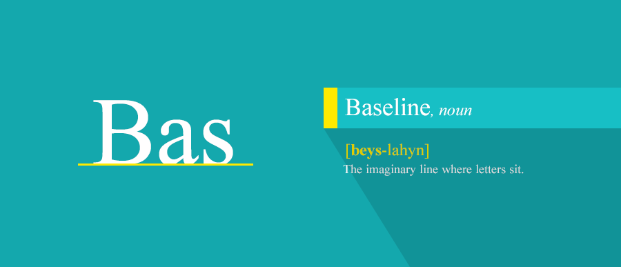
3. Ascender
Well, the ascender, in typography, expresses the mean line of a font. It makes the font more recognizable, more “warm” if you choose to put it like that.
4. Descender
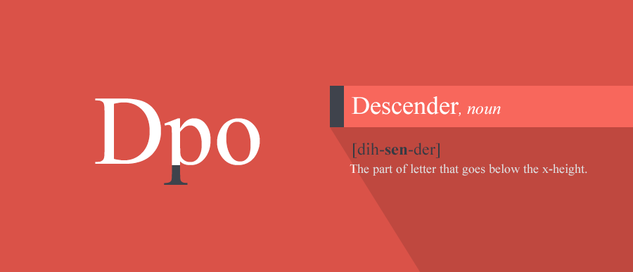
As opposed to the ascender, the descender is that part of the letter that goes below the x-height.
5. Uppercase
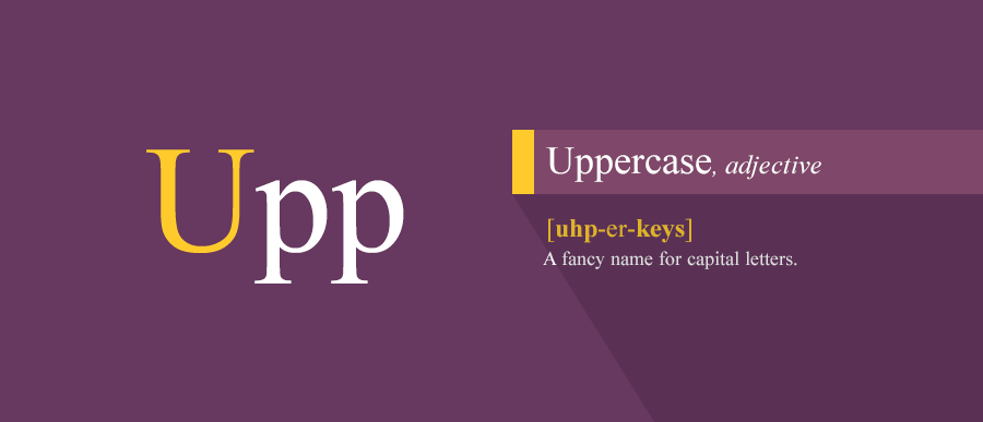
Just a fancy name for the capital letters.
6. Lowercase
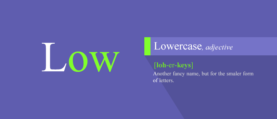
Another fancy name, but for the smaller form of letters.
7. Serif
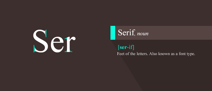
Serif represents the feet of the letters. Also known as a font type.
8. Shoulder
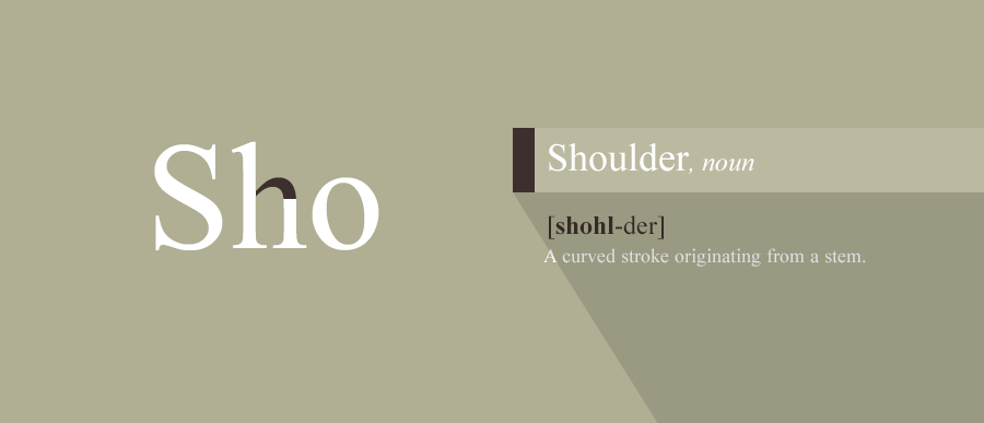
A curved stroke originating from a stem.
9. Stem
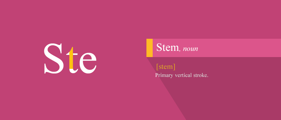
Nothing more than the primary vertical stroke.
10. X-height
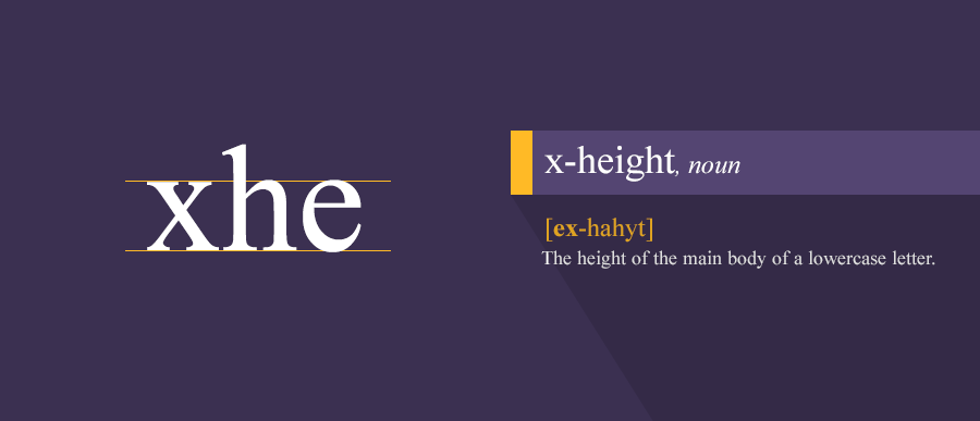
The height of the main body of a lowercase letter.
11. Bowl
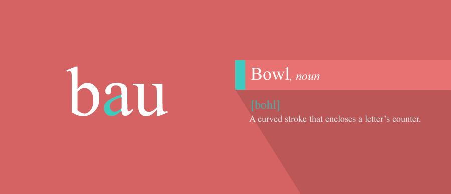
A curved stroke that encloses a letter’s counter.
12. Counter
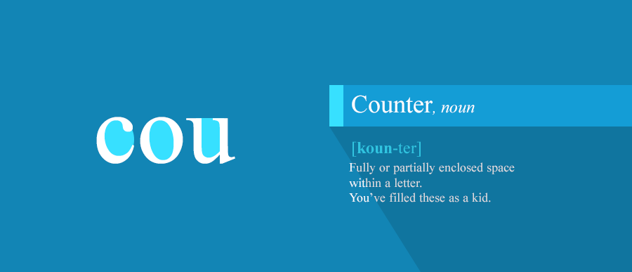
Fully or partially enclosed space within a letter. These space stirred your imagination as a kid.
13. Stroke (diagonal)
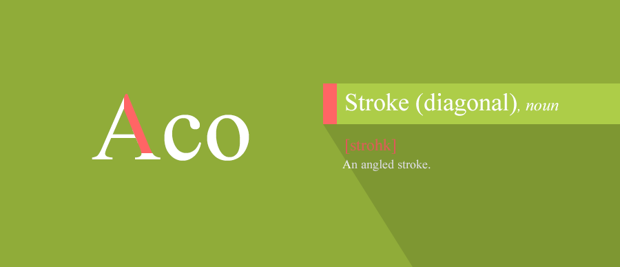
An angled stroke.
14. Spine
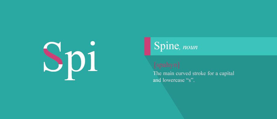
The main curved stroke for a capital and lowercase “s”.
15. Arm
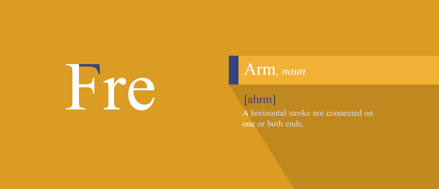
A horizontal stroke not connected on one or both ends.
16. Leg
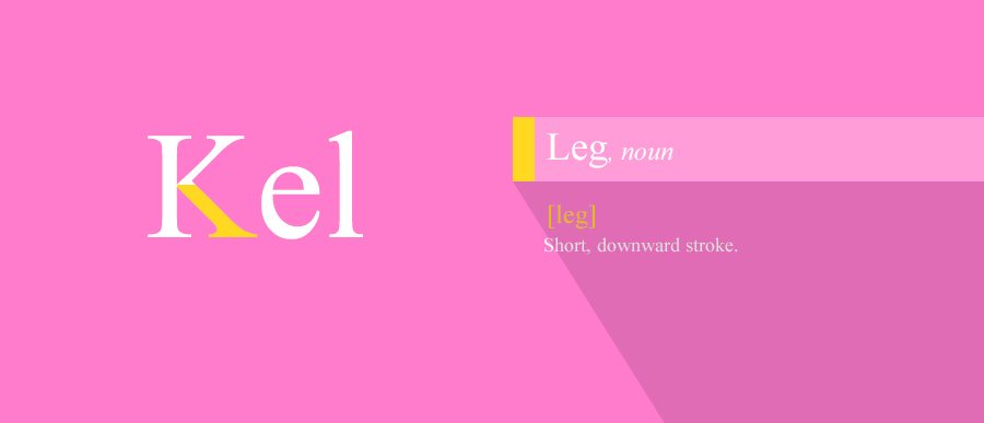
Short, downward stroke.
17. Cross stroke
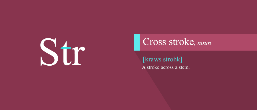
A stroke across a stem.
18. Ball terminal
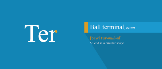
An end in a circular shape.
19. Hairline
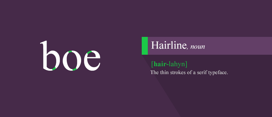
The thin strokes of a serif typeface.
20. Apex/Vertex
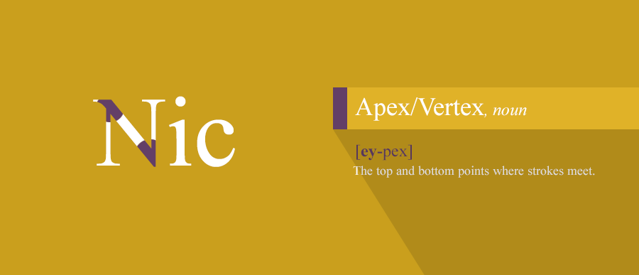
The top and bottom points where strokes meet.
21. Arc of stem
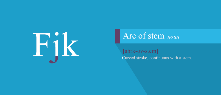
Curved stroke, continuous with a stem.
This is where your journey ends! Hope this guide proved to be useful to you and now you can fully master the fascinating art of Typography.
#
#