January 6, 2025
Resetting Password: Design Brief and Lesson
Source: The best way to learn UX/UI design. (n.d.). Retrieved from https://app.uxcel.com/design-briefs/reset-password-flow-007
Explore techniques to streamline the password reset flow and minimize user effort
On average, people use 4-5 passwords per day. Due to hard security rules, users keep forgetting their passwords to log back in. In these moments, users may experience disappointment, annoyance, or even guilt. In fact, 75% of online customers won’t complete their purchase if they fail to recover a password while checking out.
To ease their pain, the process of password recovery should be smooth and fast without holding back users from completing their tasks.
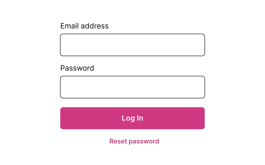
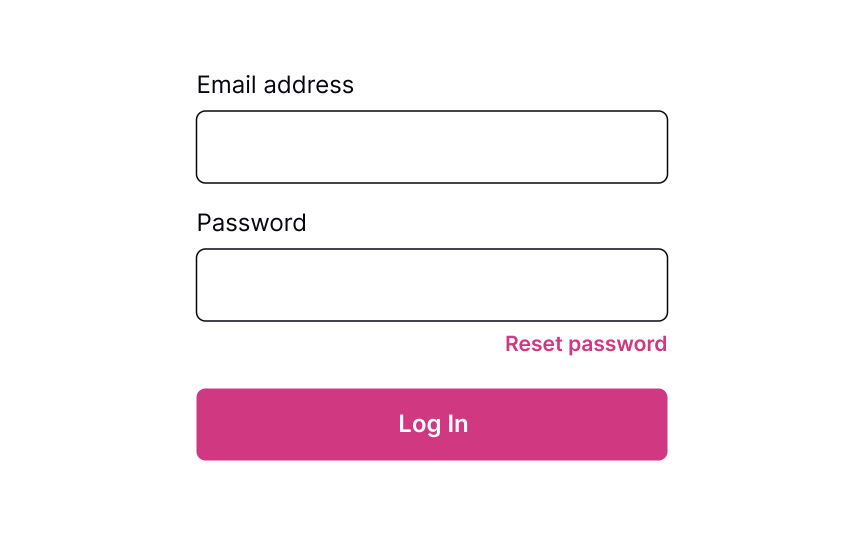
Place reset link close to the password field
Providing users a Reset Password link works like an “emergency exit,” supporting Nielsen’s heuristic about user control and freedom. The heuristic advocates users’ rights to make mistakes and states that a system should allow users to get out of trouble without much effort.
The Reset Password link gives users an opportunity to recover from an undesirable situation and makes them feel more relaxed and comfortable.
Although the Reset Password link isn’t the primary action on a page, it should still be visible. Place it below the password input where users expect to see it, show its clickability, and provide a straightforward label that eliminates any doubts about what happens when users click it.
Ask for account details to verify
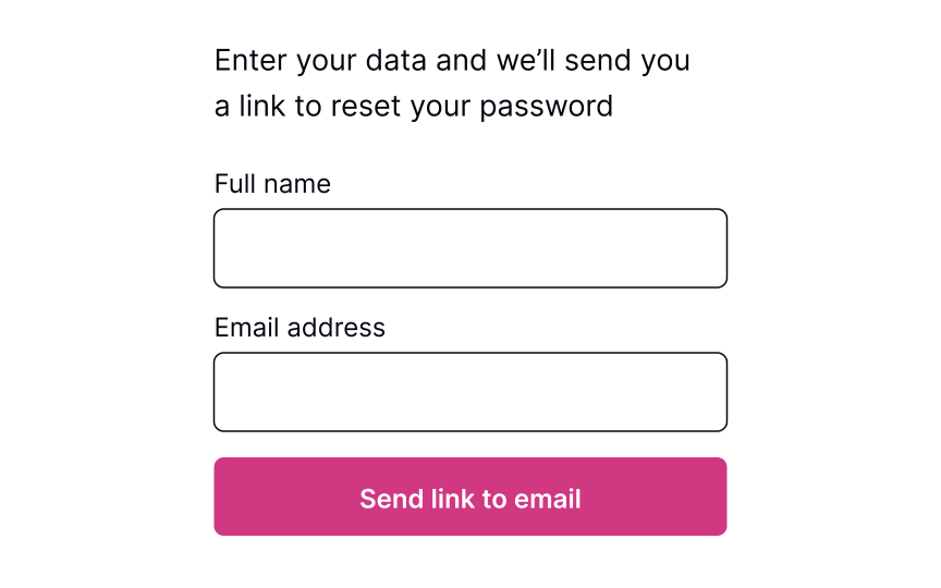
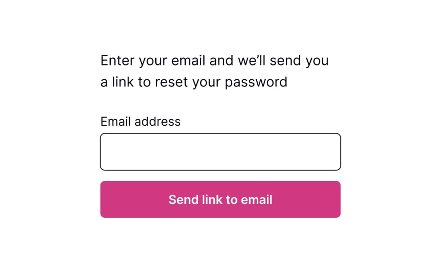
Commonly, systems ask for an email to send users a link or a phone number to send a code to recover the password. This data is usually enough to identify a person and help them restore their login information securely.
The process should be quick and painless, so avoid asking unnecessary questions and making them fill more than 1-2 fields. Otherwise, users may feel insecure or simply abandon the product.
Pro Tip! If users have already entered their email address or phone number on the previous login page, prefill this data on the reset password page to speed up the flow.
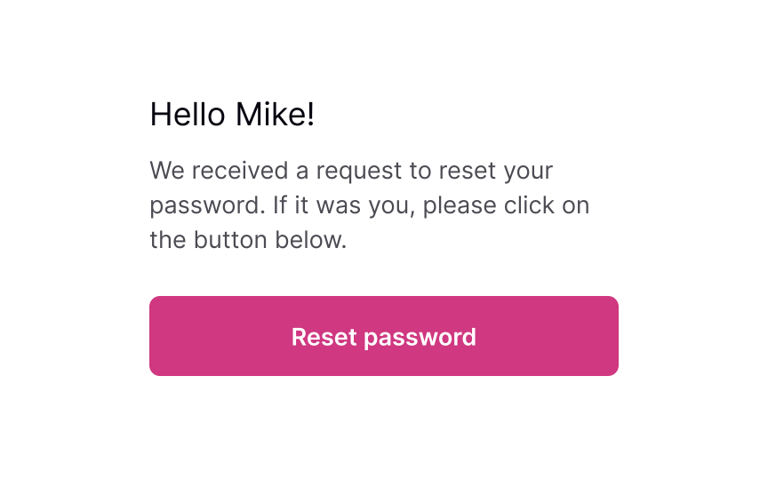
Show the confirmation page
Once users provide their email or mobile phone, show them a page explaining what happens next. If you ask for an email, inform users to check their inboxes for an email with a password recovery link. If you ask for a mobile number, notify users that they will shortly receive a code or link on their phones.
Keeping users up to date makes them feel confident that everything will be okay and they will recover their account in a short time.
Explain next steps
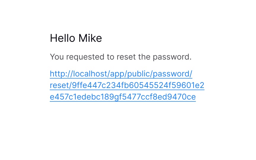
After you send users a password recovery link to their emails or phones, your job isn’t done. The email or text should contain clear and straightforward instructions on what to do next.
Avoid including too much text — a prominent link to the reset page or a code that allows users to reset their password should be included.
Reset the password
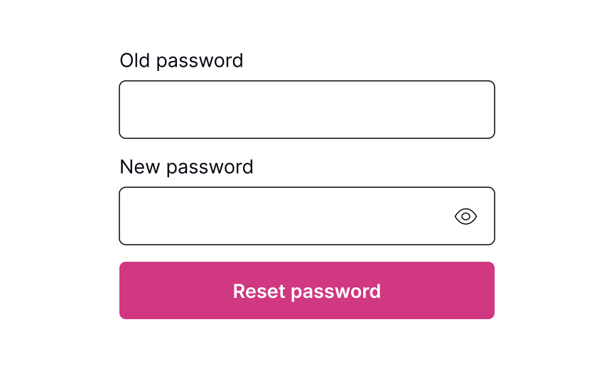
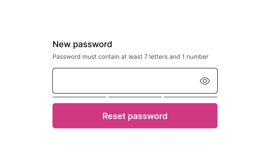
Whether it’s a verification code or a link to click, the next page should include a clear input to enter the new password. Don’t forget to include password requirements and make sure users can see them the entire time while typing. If there are more than a couple of password requirements, consider adding bullet points to make the instructions scannable.
Pro Tip! Never insert password requirements inside the field label or placeholder.
Password successfully reset
After users successfully reset their password, it’s a good idea to congratulate them. Resetting a password can be a frustrating experience, so acknowledging their success can create a positive user experience. Once users have reset their password, redirect them to their intended destination — the login page.