January 6, 2025
UX Design Patterns with Checklist Design
Source: The best way to learn UX/UI design. (n.d.). Retrieved from https://app.uxcel.com/courses/flows-by-checklist-design
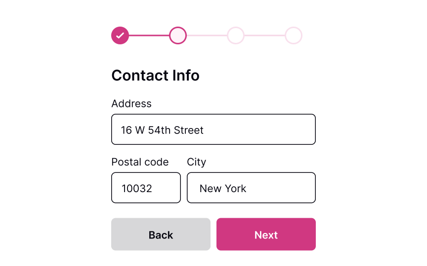
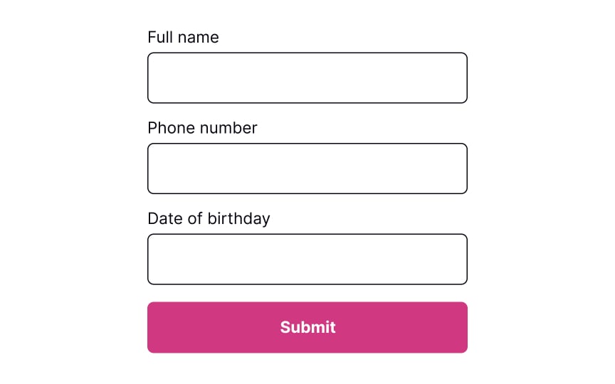
Submitting a Form
Ensure a seamless user experience by learning how to optimize your form design
Interaction Design
5 exercises
Start +250px
Forms exist to help users achieve anything from creating an account to subscribing to a newsletter. They are often the last step before users achieve their goal, so they should be quick and easy to complete. When forms consume too much time, use complicated language, or ask too personal questions, users tend to leave.
Multiple factors like alignment, structure, spacing, the design of buttons and inputs, and typography can make or break the overall experience your users have when trying to complete a form. eBay increased its annual income by 500 million dollars after it redesigned just one button on one of the mobile form screens. If you want to convert more leads and create a good impression as a user-friendly product, consider form design with great attention and respect.
Show a button to submit
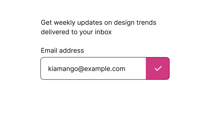
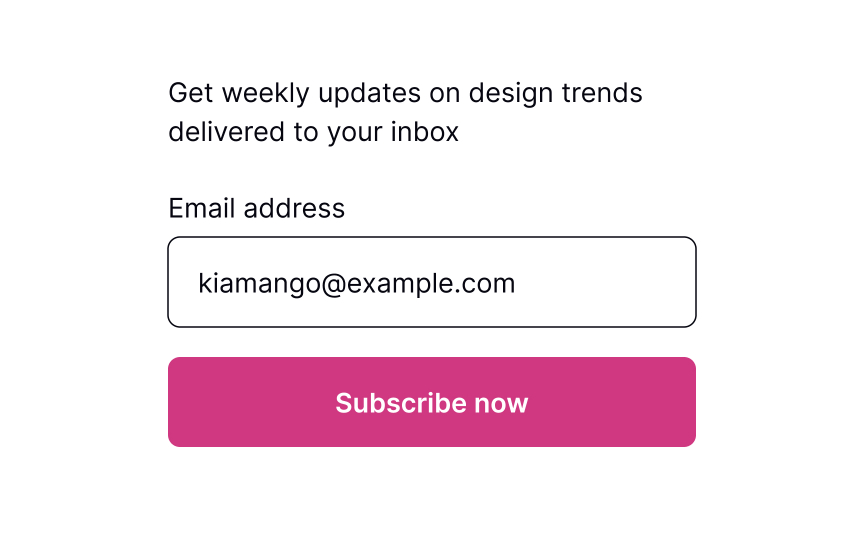
The primary action button allowing users to submit information should always be in sight. The most intuitive placement is below the form fields or in the upper right corner. On mobile, if the form is long and users need to scroll, fix the button position so it won’t disappear.
The button’s label should be straightforward and on-point. Users should immediately understand what happens after they press it. You can change the copy to fit the form, e.g., the button can say “Subscribe” if someone is providing their email address to receive emails.SaveShare
Show loading state after submission
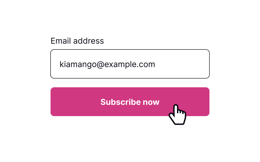
The loading state helps users see the form is in the process of being submitted. According to the first of Jakob Nielsen’s 10 Heuristics, visibility of system status is crucial — the system should always keep users informed about what is happening right now and provide clear and on-time feedback. This makes users feel in control of the system, so they know how to act to reach their goal. Showing the button’s state also increases user trust in the brand.[1]
Pro Tip! Make sure you also added a hover state that arises when users are about to press the button. SaveShare
Show success message when it submits
Once the form is submitted, communicate that back to users with a clear success message. First, showing a success message follows Nielsen’s Heuristics about the visibility of the system status. Second, it increases user satisfaction when they achieve one of their goals.
Pro Tip! Don’t overdo it. Show success messages only when necessary and make them disappear automatically after a while.SaveShare
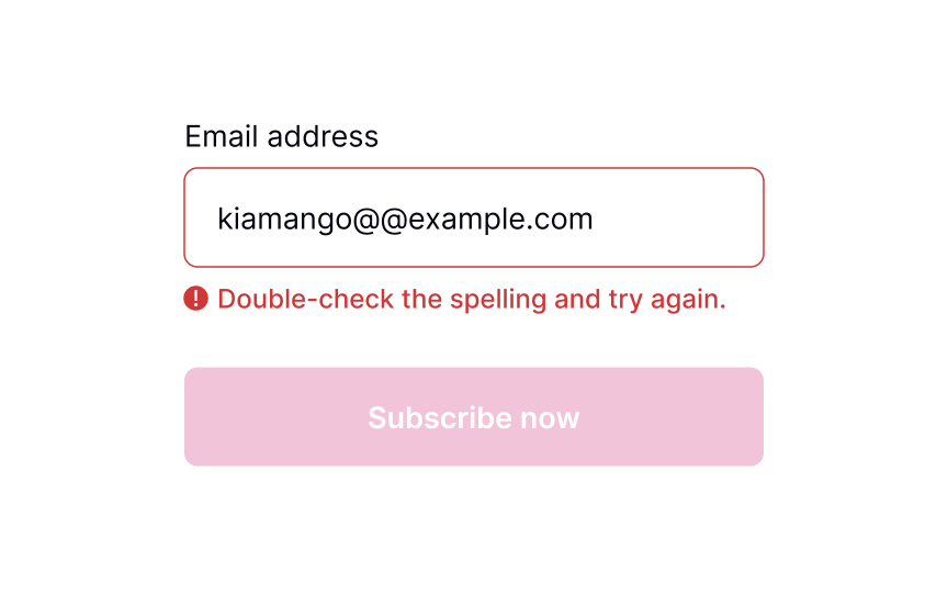
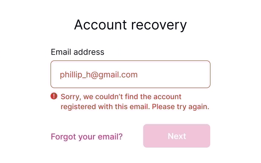
Show an error message if necessary
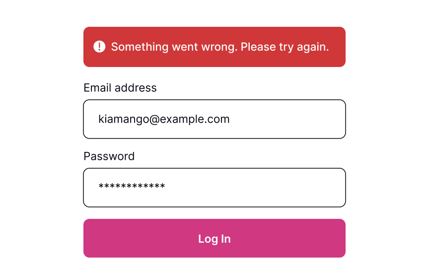

Sometimes, things don’t work out. If the form can’t be submitted due to invalid information or another error, let users know about it.
When users see that something went wrong, they may feel disappointed, irritated, and stressed. A formal, ambiguous, robotic message is the last thing they need to see. Good error messages should be polite, clear, and informative. Clearly explain to users what happened and provide advice on what they should do next.[2]
However, providing specific error details (e.g., whether the username or password is incorrect) can be a security risk. Display error messages like “Invalid username or password” to prevent revealing information that could aid attackers.
Pro Tip! Avoid using technical terms to explain what caused an error. Act like a human and use simple words that users can relate to. SaveShare
An error may occur because of incorrect data
As humans, we all make mistakes, and sometimes, users provide incorrect data that doesn’t meet input criteria, preventing the system from submitting the form. To value users’ time, it is important to inform them about these errors promptly, instead of waiting until they hit the Submit button. Therefore, it is recommended to validate each input after users fill in the information and move the focus away from the input.
To provide effective feedback, the error message should be concise yet precise, clearly indicating what went wrong and how users can fix the problem to continue with their task.
Pro Tip! Avoid validating each input while users are typing. It annoys people and creates mistrust of the product.
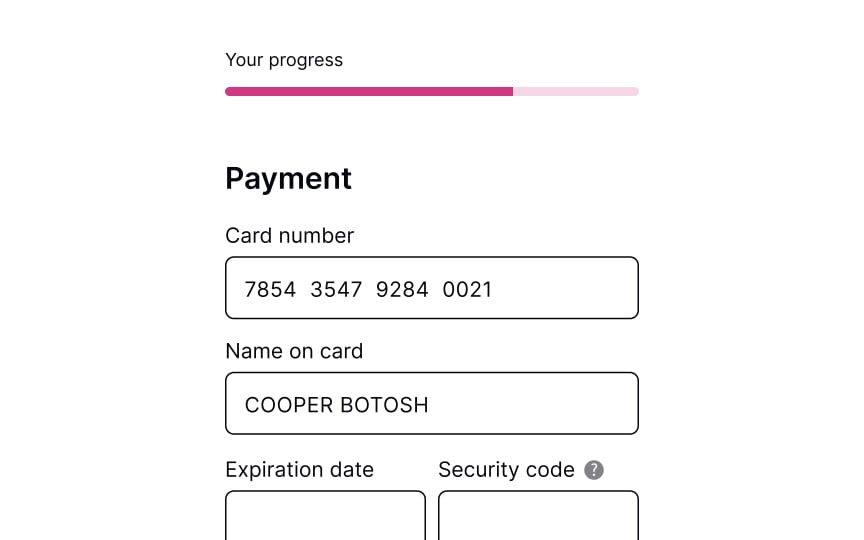
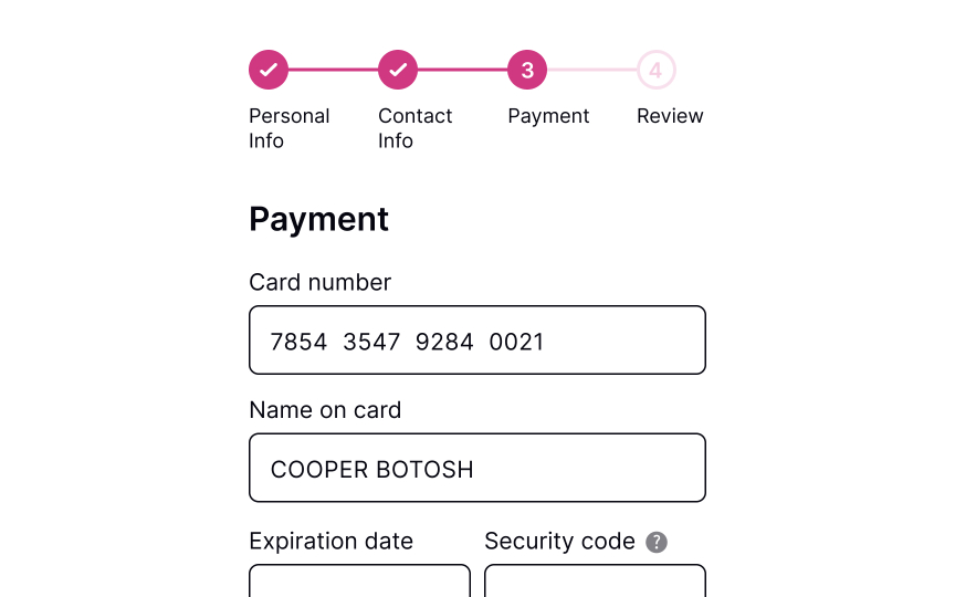
Making a Payment
Explore best practices for designing a smooth and secure checkout experience
Interaction Design
6 exercises
Start +250px
If you’re running an online business, the checkout process is the desired destination of the selling journey. You’ve come a long way driving users from their first acquaintance with the product to the final stage of making a purchase. But don’t relax just yet! You have to ensure that the checkout process, especially the part of providing payment details, is smooth, secure, and painless, making users feel confident that they made the right choice coming to your website.
You should consider adding multiple payment options, provide enough feedback when users submit their confidential data, and clearly outline what’s coming next after they make a payment. It’ll be disappointing to lose a customer at the final stages, so take this task seriously and try to minimize any risk of confusion or uncertainty.
Offer payment methods
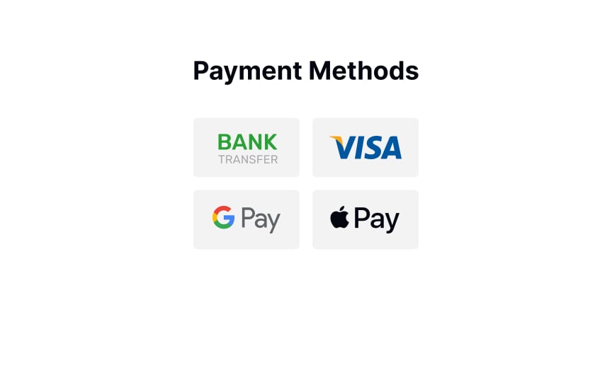
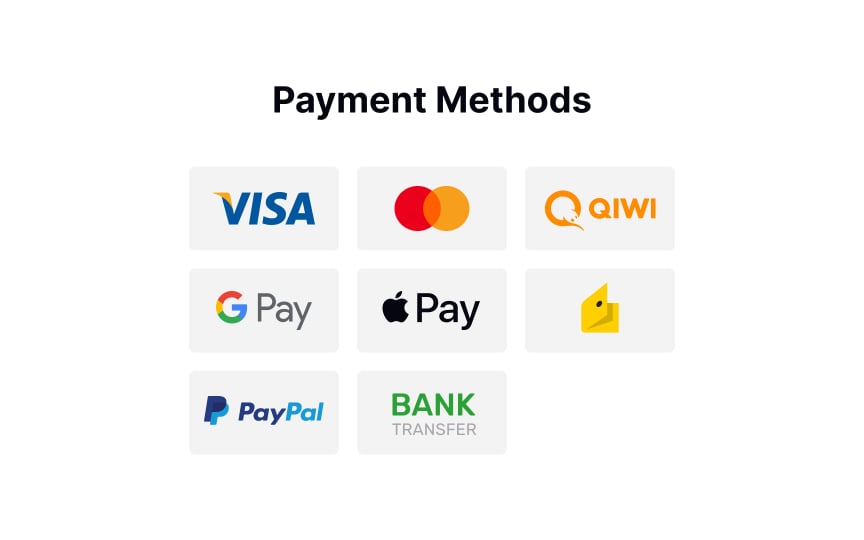
According to studies by the Baymard Institute, your website or mobile app should provide as many payment methods as you can if you sell internationally and don’t want your users to have any trouble paying for your product/service.[1] However, it’s true that seeing too many unnecessary payment options confuses users and causes choice paralysis. So what’s the best solution?
Learn your audience and provide a range of payment options that are relevant to them. For example, credit cards are becoming less dominant in many countries like Germany, Russia, and China. If you don’t sell to the UK, there’s no point in offering BACS Direct Debit payment options.SaveShare
Request payment details
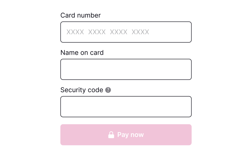
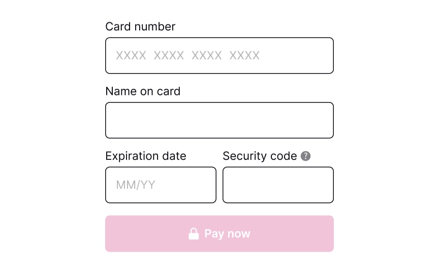
When requesting payment information from users, it’s important to ensure that all relevant text inputs are provided and that their size is appropriate for the details being entered. Some inputs may require users to provide unfamiliar or unclear information, in which case it’s helpful to offer a brief but informative explanation. One effective way to do this is to include an information icon that users can click for more details.
Pro Tip! In a product where users may make repeat purchases and saved payment methods are available, consider a flow that allows users to add/remove payment methods.SaveShare
Validate payment details
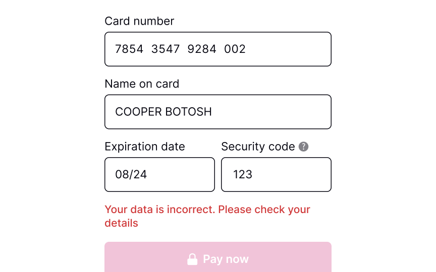
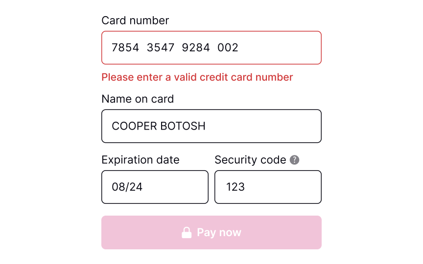
Users are humans, and they make mistakes, especially when entering payment details on mobile and using one hand. It’s vital to consider adding validation before users submit their payment details. Users mistype numbers, or the card may have expired — so make sure to address these numerous error states.
To make users’ lives a bit easier, consider adding input masks — i.e., constraints on the input text. Masks help ensure that numbers or strings meet the expected format, prevent any unnecessary errors, and reduce friction prior to system validation.SaveShare
Show payment processing
Payments may not be processed instantly and can take a few seconds or even a few minutes. Therefore, it’s crucial to add a loading page to reassure users and alleviate any concerns they may have about their payment. By displaying the current status of the system, users are more likely to trust the payment process and feel in control of the transaction. This can help increase credibility and improve the overall user experience.SaveShare
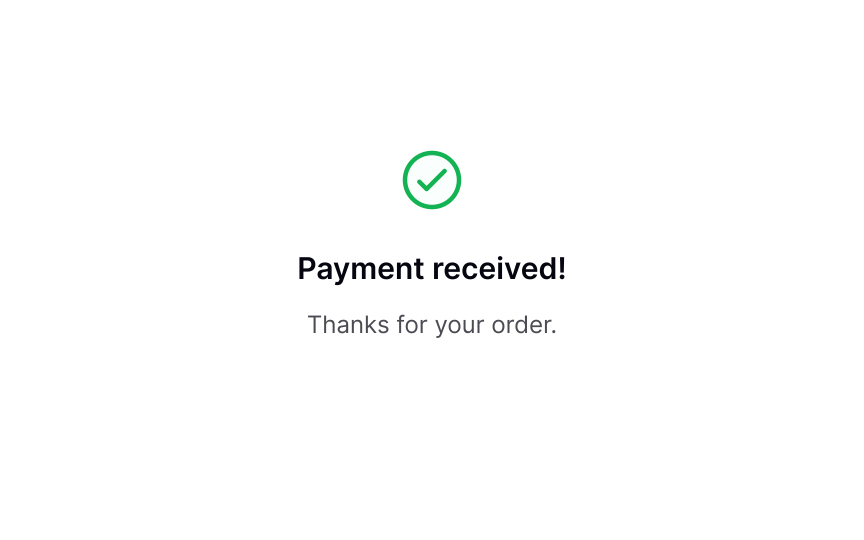
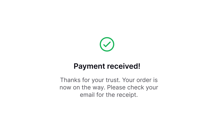
Confirmation of payment processed successfully
Once users have submitted their payment, a success message should appear, confirming that the payment has been processed and the funds have been received. This provides a sense of satisfaction and completion to users. To ensure that the success notification is effective, it should be clearly visible and given enough time to be read by users.SaveShare
Outline next steps
After users have made a payment, it’s important not to give the impression that your job is done. Instead, take the opportunity to express gratitude and offer information about the next steps if needed. For example, if they have purchased a product, thank them for choosing your brand and provide them with shipping updates. If users have signed up for a subscription, provide them with a link to start using the product or suggest that they check their email to activate the subscription.
This helps build a positive relationship with users and ensures that they are fully informed about their purchase.
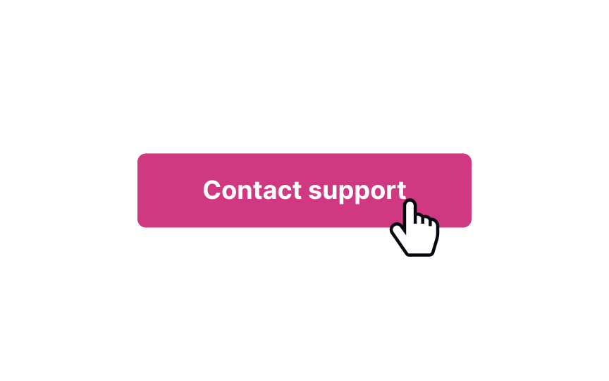
Contact Support
Learn how to offer clear and accessible communication channels to address user needs
Interaction Design
7 exercises

Start +250px
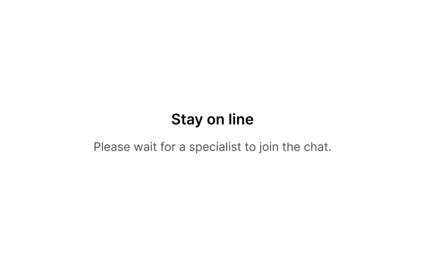
The best way to improve customer support is to eliminate the need for it. However, the nature of UX is such that we don’t understand how successful a design is until it goes live. To make sure that users don’t abandon their tasks, offer them clear ways of communication with your company.
To provide the best support possible, you need to understand why, when, and where users need it. This will help you offer the most suitable communication methods — live chat, phone call, or a link to F.A.Q. — in places where users expect to find them.
Collecting feedback on these interactions will give you invaluable insights into UX failures. Implementing this knowledge to improve your product can eventually reduce the need for customer support.
Why users contact support
To provide the best customer support, you need to understand why users need it. According to the Nielsen Norman Group, users contact customer support in the 4 cases mentioned below in order of their frequency:
- The information they’re looking for is missing or isn’t clear enough. For example, a user might contact support if they don’t understand the difference between the two products offered.
- There’s a service problem. For example, a payment failed or the product arrived damaged.
- Users encounter roadblocks and can’t finish the task. For example, users can’t modify their order and must contact the representative to make changes.
- The task seems too complex. For example, if getting an insurance quote online looks too difficult, users can contact an agent instead.
In 64% of cases, the need to contact support results from a UX failure.[1] But before these shortcomings can be fixed, you need to ensure that customers have all the necessary methods to get in touch with the company and finish their journey.SaveShare
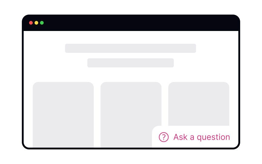
Show methods of contact
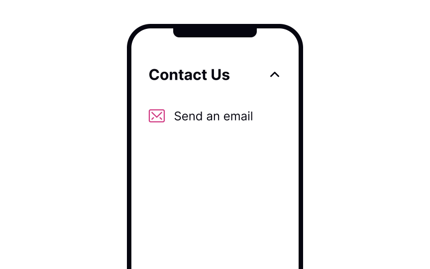
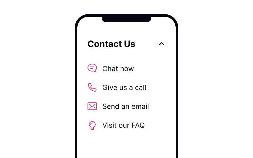
According to research by the Nielsen Norman Group, the most common method of contacting customer service is by phone, followed by email, online chat, and social media.[2] However, not all issues require human contact, and many common problems can be resolved through a well-designed F.A.Q. section.
The order in which you display contact methods should consider not only user preferences but also your available resources. Providing a F.A.Q. section as the first option can be beneficial since it allows users to find answers to their questions without waiting for a response.
Online chat and telephone support are ideal for specific, complex issues that require an immediate response. While these options may be more convenient for users, they can be challenging to support, particularly for smaller teams or businesses operating in different countries and time zones. You can prioritize these options by placing them lower on the list of contact methods.
Pro Tip! Make sure all contact options are visible and clearly indicate what they are. Some of the most frustrated users in the aforementioned study were those who needed to contact an organization and could not do so.SaveShare
Make the support page easy to access
Make customer support easily accessible. As it’s impossible to always predict when users will need to contact the company, offer fixed links that they can easily find on every page. The most common places for the support page link are the footer on websites and the settings page in mobile apps.
Error pages are places where you can predict the need for customer support. Offering assistance at the point of error can ensure that users complete their tasks successfully.
Pro Tip! The documentation or F.A.Q. page shouldn’t contain any obvious information. If users come to this page, they will want to know more details.SaveShare
Be specific about the waiting time and the method of communication
If users select a method implying communication — for example, phone call, chat, or email — make it clear how the process goes. There’s nothing worse than clicking the button that says “Contact us” and finding yourself in an unexpected video call.
Offer the response time estimate and say what information users will need to provide. Most often, it’s their name, email, what their issue is, etc. If communications are recorded (like phone calls), inform users about the reason for doing so in advance.SaveShare
Offering support at the point of error
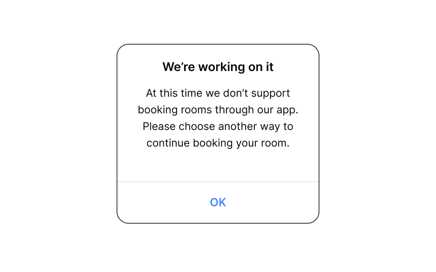
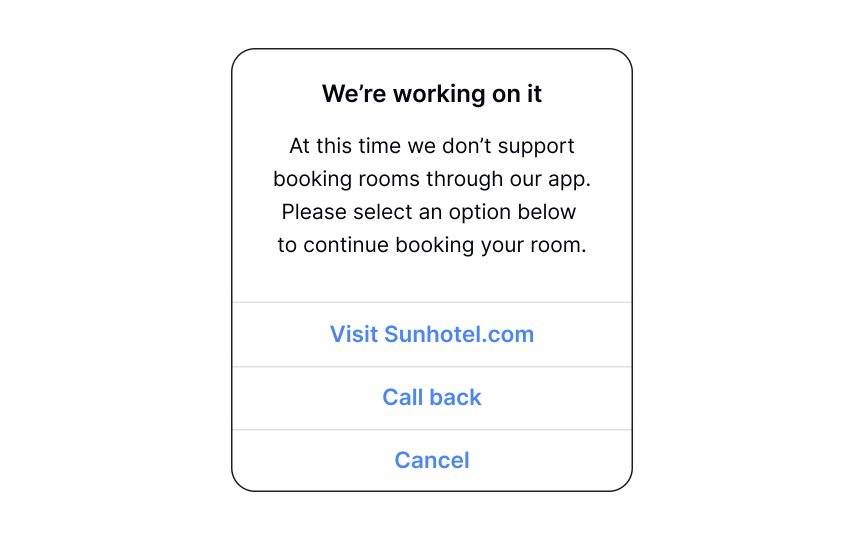
A good error message identifies the problem, explains the possible causes, and offers a solution. For some issues, that solution can be contact support. The contact method, in this case, depends on the type of error.
For example, if a customer can’t connect a device to an app, you can link to the F.A.Q. or a help article about connecting devices. If the function isn’t supported online, allow users to talk to a representative or offer another alternative. When creating error messages, ask yourself what the next step users can take is and how you can make it easier.
Pro Tip! Sometimes, adding tooltips to prevent input errors will eliminate the need for error messages altogether.SaveShare
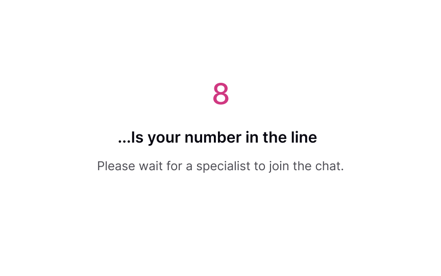
Offering chat support from every page
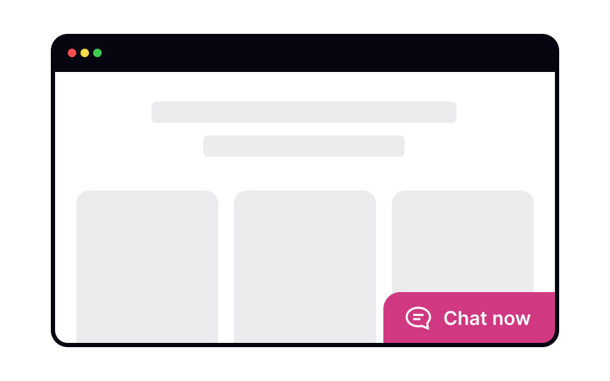
Сhats are becoming a more convenient and less personal alternative to phone calls for customer support. Users expect to find the chat on the Help or Contact Us pages, so play to their expectations. Label it clearly as Chat or Live Chat — other labels will confuse users.
A common practice is to use a chatbot to get user information and identify the issue, and then redirect users to a real person. Make it clear that you’re using a chatbot from the beginning — it will help users adjust their language and expectations.
If live support isn’t available at the moment, let users know and offer them other means of support — for example, visiting the F.A.Q. section or sending an email.[3]SaveShare
Conclude a support request
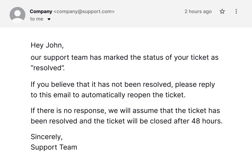
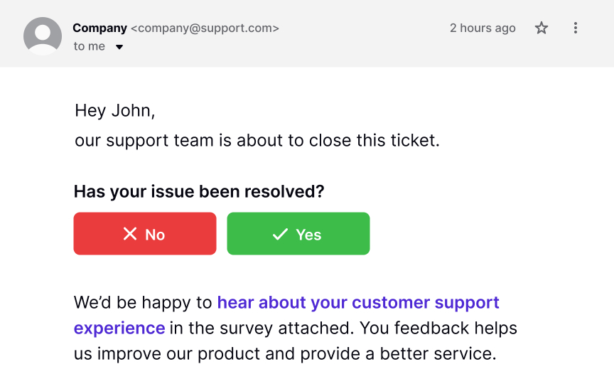
Customer feedback is the cornerstone of improving the support provided. It also helps ensure that users complete their tasks successfully.
After providing help, send a follow-up email to ask if the customer’s issue has been resolved. For live chat requests, include the chat transcript so that users can review them as needed. Timing is crucial in this matter. Send the email with the feedback form after the customer’s issue has been resolved but while the support experience is still fresh in their mind.[4]
Pro Tip! Explain why you’re asking for feedback. Users give feedback more readily when they know that it’s going to be put to productive use.
Deleting Account
Explore how to handle user departures in a respectful and professional manner
Interaction Design
8 exercises
Start +250px
Sometimes, users decide they don’t want to use your product or service — and that’s okay. Users come and go, and it’s important to understand that your product can’t serve all users’ needs and solve all users’ problems. Some companies combine two methods of exit — deactivating an account and permanently deleting it. Deactivating allows users to restore their accounts during a certain period (a week or 30 days) and permanently deletes them after this period ends.
For those users who want to leave, make it as simple as possible. You can try to understand why they’re leaving, but don’t be clingy. Whatever you do, avoid being passive-aggressive or guilt-tripping. It’s unprofessional and makes you look desperate. Plus, users will remember this and may share their experience with others who will reconsider your product.
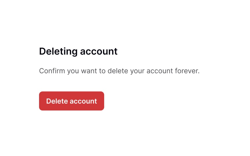
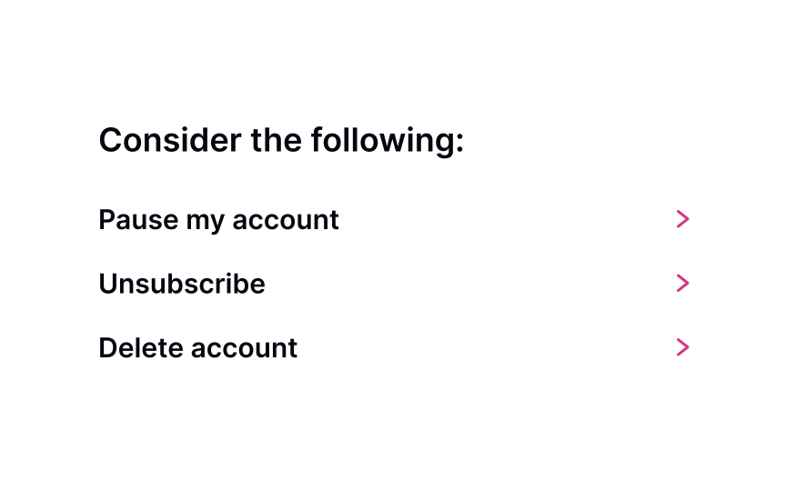
Show a link to delete the account
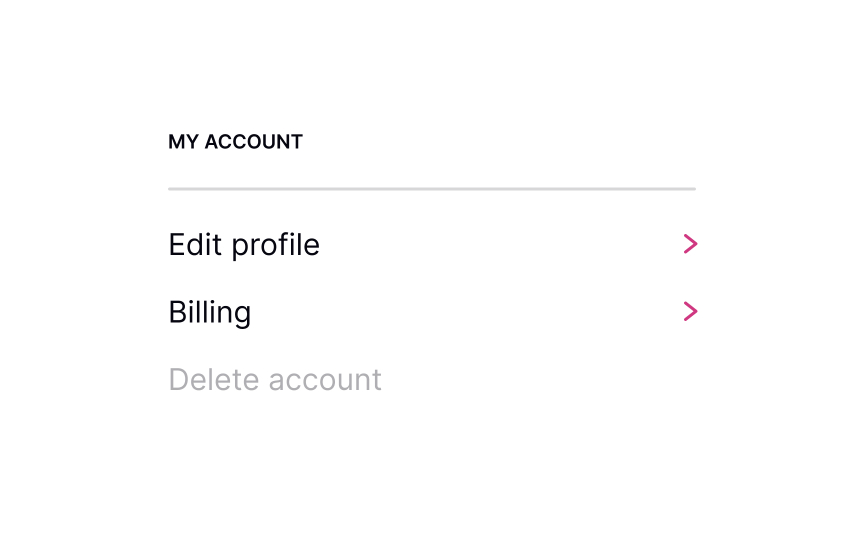
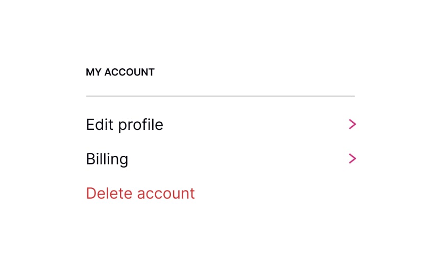
Making it difficult for users to delete their account by hiding the “Delete Account” link creates a negative impression that may limit users’ trust in your product and harm your reputation. Therefore, the link or button to delete the account should be visible and easily accessible on the profile, settings page, or even in the support area. By doing so, users feel in control of their data, which can increase their confidence and trust in your product.
Pro Tip! However, you shouldn’t encourage destructive actions. Place the Delete Account link in a safe area where users can find it but not click it accidentally. SaveShare
Preserve goodwill
People don’t always delete accounts because they’re unhappy. Sometimes they just no longer need the service because they completed their task or found what they needed. Preserving goodwill and avoiding a blaming tone is the best policy to save your product’s reputation. It also means loyalty — users are more likely to give positive referrals in the future or come back to the product later on.
Hiding the Unsubscribe or Delete Account buttons or using other dark patterns to retain users at any cost never helps. If users want to leave, they will leave eventually. Your task is to create a good impression and demonstrate decent behavior while allowing them to do so.SaveShare
Politely ask for feedback
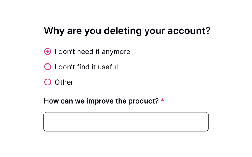
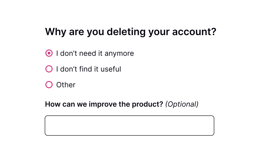
It’s good to know why somebody decides to leave. Offboarding provides an excellent opportunity to improve user experience and understand what users lack in your product. Avoid being pushy by making the feedback page mandatory. Instead, make users feel their feedback is valuable to you and that you respect their choice.
You can provide possible reasons for leaving and offer an empty input for those users who would like to share their thoughts on how the product can be improved or what they didn’t like while using it.SaveShare
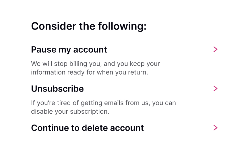
Reiterate the value proposition
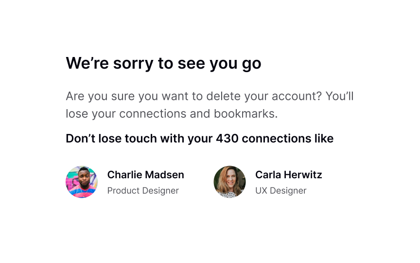
When users decide to leave, they’re likely to leave. However, it’s never too late to remind them what they stand to lose if they delete their account or unsubscribe and the benefits they will retain if they decide to stay.
When showing the benefits and consequences of leaving, be brief but informative. You may even offer users to change their membership plan if the one they’re using isn’t satisfying. If done correctly, users may reconsider their decision and, instead of deleting their account, pause it temporarily.
Pro Tip! Avoid distracting users from the cancellation process by hiding the Delete Account/Unsubscribe button.SaveShare
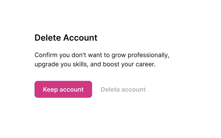
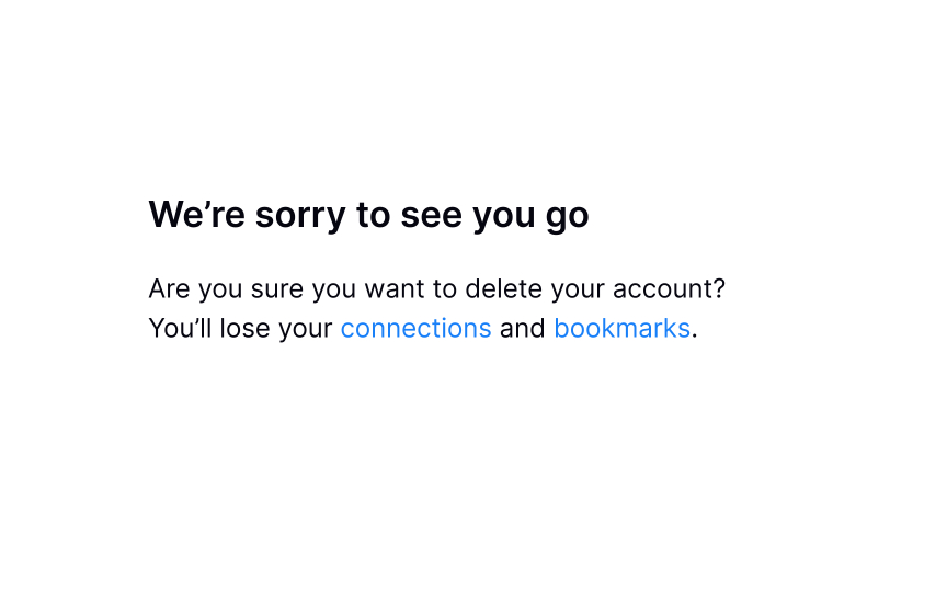
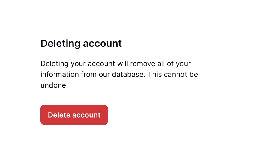
Explain the consequences
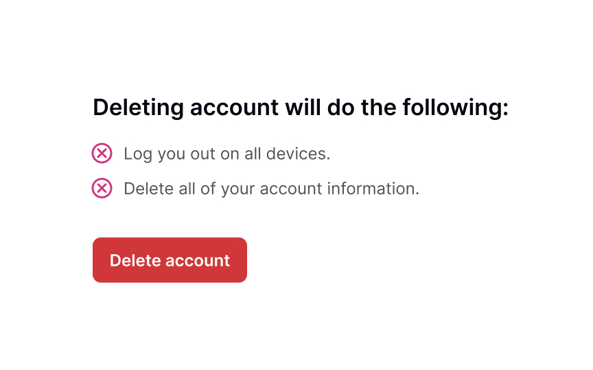
Once users confirm they are sure they want to leave, be clear with what happens to the account and all the information once the account is deleted. Is all their data permanently deleted? Can they come back and restore their account? Is the deletion immediate, or can they use their account until a specific date?
This is the right time to offer an option to pause their membership so that users can come back later and won’t lose their data. You can also shortly explain the benefits of membership, which might stop users from permanently removing their accounts.SaveShare
Typing confirmation vs. clicking a button
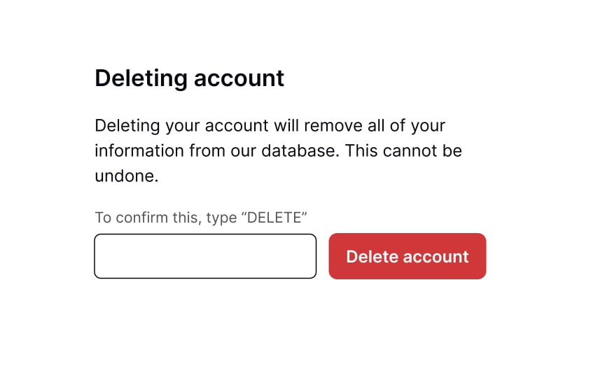
Sometimes, account removal or deletion may have serious repercussions, like the permanent loss of data or access to important documents. It’s your job to ensure that users make the decision intentionally and fully understand what it will cost them.
The best way to prevent users from accidentally clicking on the Delete button is to ask them to take additional steps, such as manually typing “delete” or re-entering their passwords. This intentional roadblock in the flow offers users a chance to reconsider their decision or give it more thought before clicking the confirmation button for good.SaveShare
Offer alternatives
Understanding your users’ needs and why they started using your product in the first place can help you be more flexible and provide alternatives. For example, if your product is for students, they may not need it on holidays and definitely won’t want to be charged for these months.
Offer them options to pause their account or temporarily deactivate it rather than permanently deleting it. Make sure each option has an exhaustive and straightforward explanation of what it implies. Users should understand the consequences of deleting their account or deactivating it temporarily.
Put yourself in your users’ shoes and consider the potential risks of each option. Ask and answer questions like:
- “Can I restart my membership and keep my preferences and data in the future if I deactivate my account?”
- “Will I have access to my data if I unsubscribe?”
- “Will my profile stay visible to the public if I deactivate it?”
SaveShare
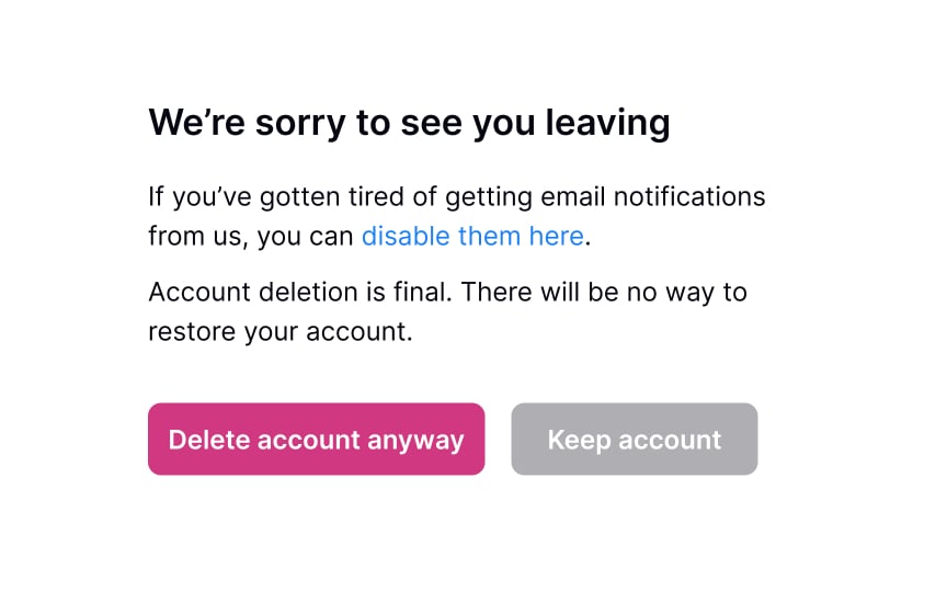
Confirm account deletion
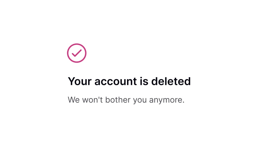
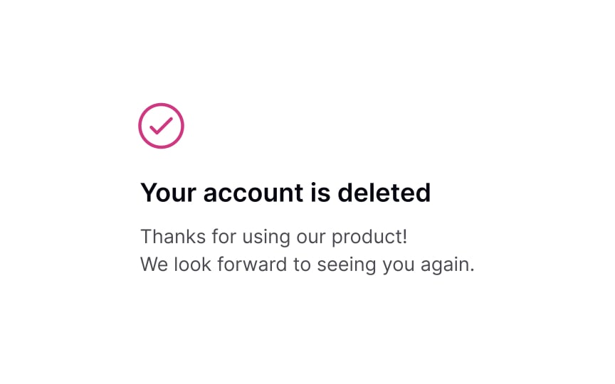
Once a user has deleted their account, it’s important to acknowledge and respect their decision. Instead of making them feel bad or guilty, embrace the opportunity to show kindness and gratitude for their past use of your product. Confirm the account deletion with a friendly and reassuring message, and express your appreciation for their membership.
Additionally, let them know they are always welcome to rejoin if they choose to do so. This approach leaves a positive impression and increases the likelihood of future engagement with your product.
Showing Progress
Learn how to correctly use progress trackers to enhance user experience
Interaction Design
6 exercises
Start +250px
Progress trackers are determinate indicators used to represent where users are in a journey. They inform them what they have completed, where they are currently, and what’s left to complete. “Visibility of system status” is one of the most important usability heuristics, which helps reduce users’ tension and uncertainty.
The power of showing progress is that it provides ongoing feedback to users. It also carves a clear path to completion for them, which increases the likelihood of them making it to the end of the journey.
When to use progress trackers
Progress trackers are a valuable feature that can improve the user experience by breaking a long form into logical and numbered steps, allowing users to track their progress. They can be especially helpful in minimizing user abandonment rates and motivating users to move forward and complete a task. By providing a clear sense of progress, progress trackers can satisfy the basic psychological need for closure and increase user satisfaction when a form is completed successfully.
On the other hand, ambiguous and confusing forms can create roadblocks, impede progress, and cause frustration for users. Therefore, using progress trackers can improve the user experience and increase the likelihood of successful form completion.[1]
In addition to tracking progress, progress trackers provide users with information about how many steps they have completed, their current position, and the remaining steps. However, it’s important to note that not all forms require progress trackers. Overcomplicating the flow of a form can be counterproductive, and progress trackers should only be used when the process is long and takes more than three steps.
Forms such as checkout processes, tax forms, flight bookings, scholarship applications, and other complex forms that require multiple steps can benefit from progress trackers. By providing users with a clear sense of their progress, progress trackers can encourage users to continue and ultimately lead to a more positive user experience.SaveShare
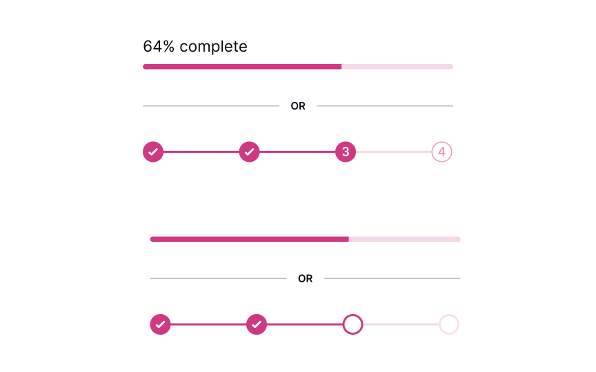
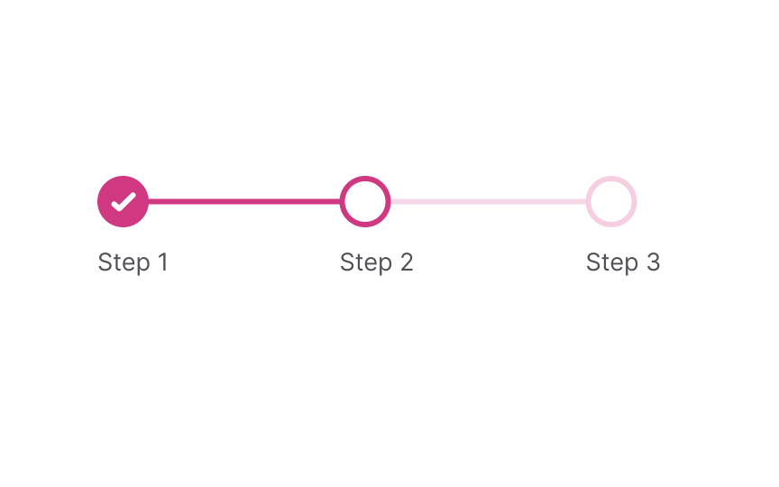
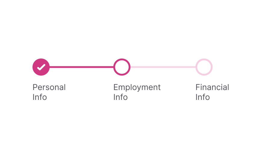
Determine your progress tracker type
The tracker can exist as determinate progress bars or numbered steps. Their main goal is to show users the current progress, how many steps are ahead, and how many have been completed. Progress trackers help encourage users to keep going and complete a specific task.
When the form is large and includes at least 3 stages, numbered steps are more helpful for setting milestones. Simply seeing the last step can motivate users to go through each step and complete a form. When the journey isn’t long, like in the case of a signup form, it can be enough to show the incremental filling of a bar as users progress.
Pro Tip! You can encounter progress trackers when purchasing online, filling in a multistep form (like booking a flight), or taking an onboarding tour.SaveShare
The importance of providing feedback to users
One of the primary goals of using progress trackers is to notify users about what is happening in the system when they fill in a form. Users may get distracted, leave the window, and get back to the form later. They should immediately understand what they’re doing, their current status, how many steps they’ve already gone through, and how many steps are waiting for them ahead.
Progress trackers support Nielsen’s “visibility of system status” heuristic. When users know what’s going on in the system, they feel in control and don’t experience any fear of the unknown.[2] Plus, people will be more likely to complete the process if they know what’s ahead of them and have a sense of completion along the way.SaveShare
Create your states
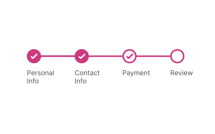
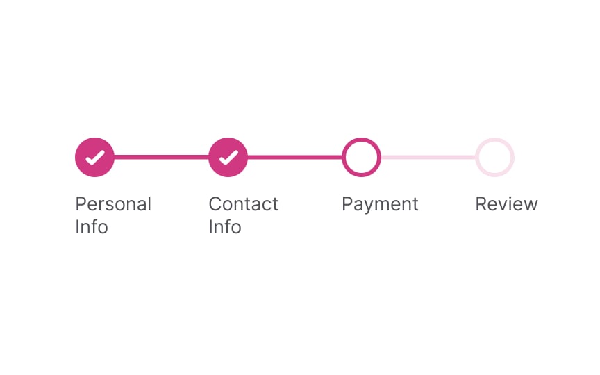
A progress tracker with milestones should always show 3 states:
- Steps that have been completed
- Current steps
- Steps that haven’t been completed yet
You can use color and unfilled circles to indicate steps that users haven’t reached yet and checkmarks to signify completion.SaveShare
Saving progress
Unfortunately, if the form is long, progress trackers can’t make it shorter. They only simplify the journey and keep users motivated. Allowing users to save their progress and get back to the task later is the right thing to do when the form may take more than a couple of minutes.
Another option is to autosave users’ progress, so even if they navigate away from a page or close the window, they are able to return to the last step they were on without losing the data they’ve already entered.SaveShare
Pick a progress tracker that fits your needs
As a final touch, you should decide how to label each milestone — by numbers, percentages, or titles. Titles add to scannability, helping users understand what they are expected to do here. Numbers and percentages motivate users to keep going, informing them about their current status and how many steps are to follow.
Depending on the complexity of your form, decide which progress tracker better fits your needs. More complex forms may benefit from being tracked with percentages — the progress indicator will move as users complete each section or subsection.
Pro Tip! In right-to-left languages, progress trackers should go from right to left instead of the standard left to right.
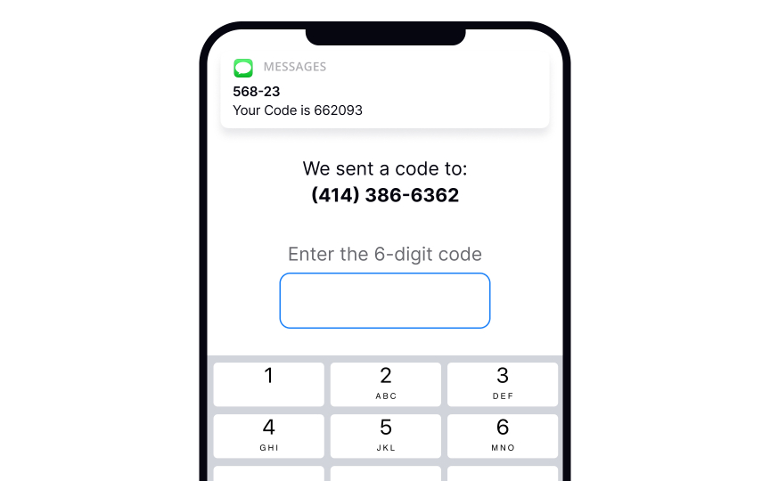
Resetting Password
Explore techniques to streamline the password reset flow and minimize user effort
Start +250px
On average, people use 4-5 passwords per day. Due to hard security rules, users keep forgetting their passwords to log back in.[1] In these moments, users may experience disappointment, annoyance, or even guilt. In fact, 75% of online customers won’t complete their purchase if they fail to recover a password while checking out.[2]
To ease their pain, the process of password recovery should be smooth and fast without holding back users from completing their tasks.
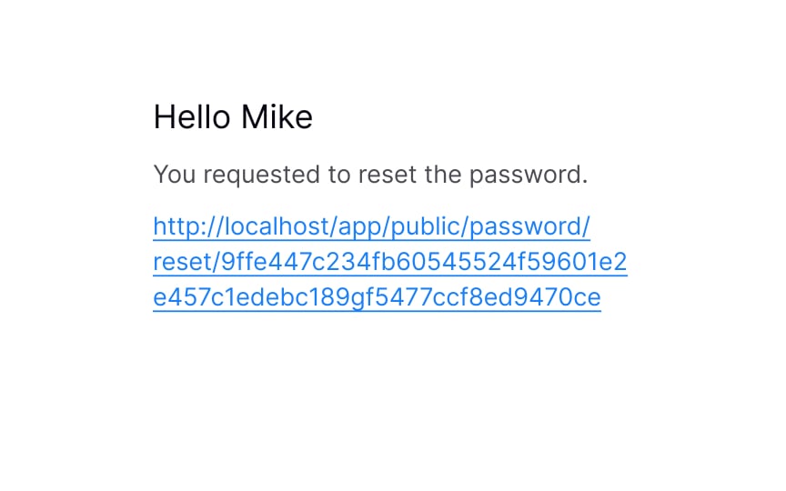
Place reset link close to the password field
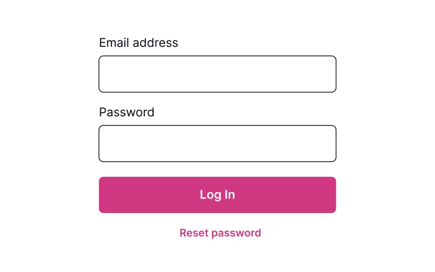
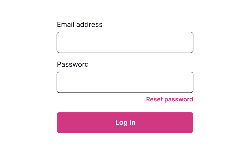
Providing users a Reset Password link works like an “emergency exit,” supporting Nielsen’s heuristic about user control and freedom. The heuristic advocates users’ rights to make mistakes and states that a system should allow users to get out of trouble without much effort.[3]
The Reset Password link gives users an opportunity to recover from an undesirable situation and makes them feel more relaxed and comfortable.
Although the Reset Password link isn’t the primary action on a page, it should still be visible. Place it below the password input where users expect to see it, show its clickability, and provide a straightforward label that eliminates any doubts about what happens when users click it.SaveShare
Ask for account details to verify
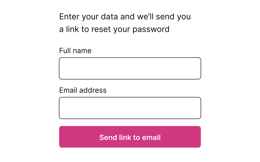
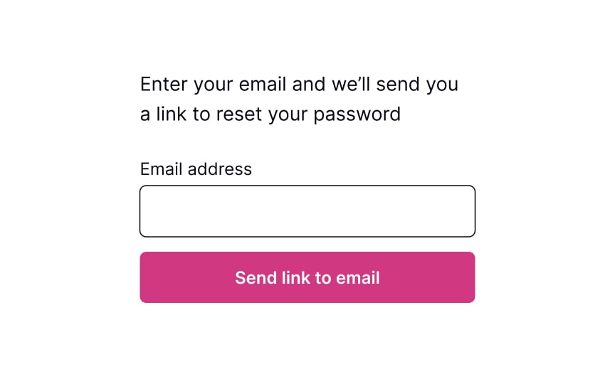
Commonly, systems ask for an email to send users a link or a phone number to send a code to recover the password. This data is usually enough to identify a person and help them restore their login information securely.
The process should be quick and painless, so avoid asking unnecessary questions and making them fill more than 1-2 fields. Otherwise, users may feel insecure or simply abandon the product.
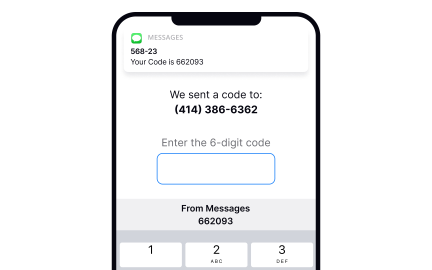
Pro Tip! If users have already entered their email address or phone number on the previous login page, prefill this data on the reset password page to speed up the flow.SaveShare
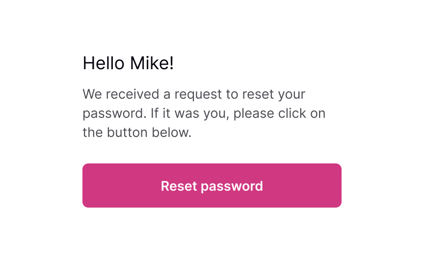
Show the confirmation page
Once users provide their email or mobile phone, show them a page explaining what happens next. If you ask for an email, inform users to check their inboxes for an email with a password recovery link. If you ask for a mobile number, notify users that they will shortly receive a code or link on their phones.
Keeping users up to date makes them feel confident that everything will be okay and they will recover their account in a short time.SaveShare
Explain next steps
After you send users a password recovery link to their emails or phones, your job isn’t done. The email or text should contain clear and straightforward instructions on what to do next.
Avoid including too much text — a prominent link to the reset page or a code that allows users to reset their password should be included.SaveShare
Reset the password
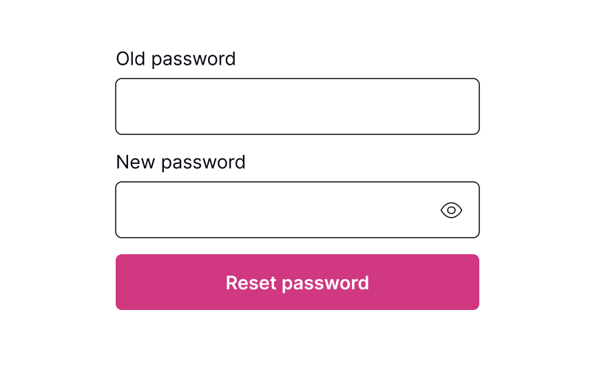
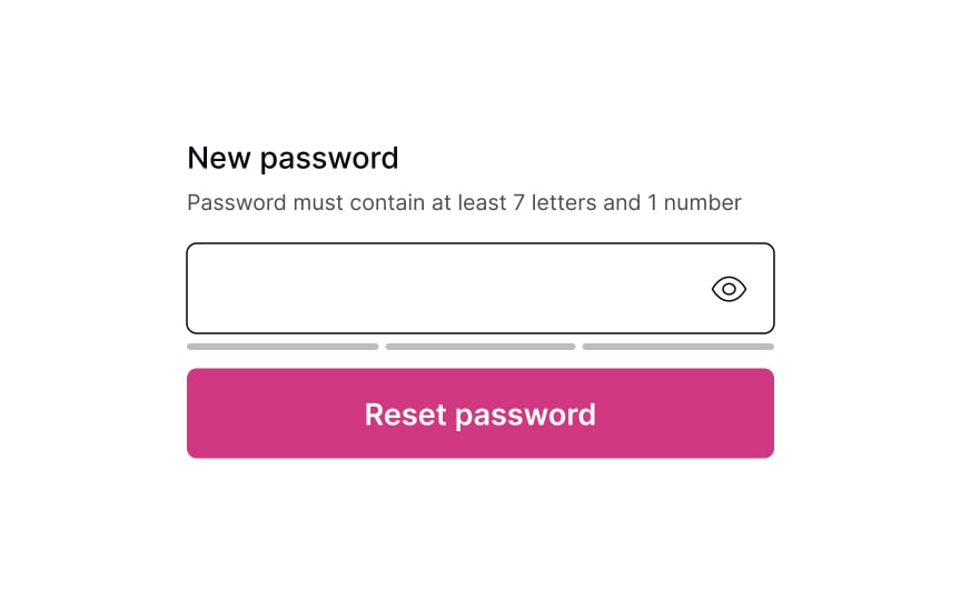
Whether it’s a verification code or a link to click, the next page should include a clear input to enter the new password. Don’t forget to include password requirements and make sure users can see them the entire time while typing. If there are more than a couple of password requirements, consider adding bullet points to make the instructions scannable.
Pro Tip! Never insert password requirements inside the field label or placeholder. SaveShare
Password successfully reset
After users successfully reset their password, it’s a good idea to congratulate them. Resetting a password can be a frustrating experience, so acknowledging their success can create a positive user experience. Once users have reset their password, redirect them to their intended destination — the login page.
Assignment
Showing Input Error
Delve into the principles of providing clear and informative input error messages that guide users toward resolving the issue
Interaction Design
7 exercises
Start +250px
Users mistype all the time — whether it’s a finger slipping or rushing through letters, errors happen. Since it is an everyday occurrence, solving an error should be obvious and seamless.
One of Nielsen’s heuristics states that a good system should help users recognize and recover from errors. What can designers do to enforce this?
- Provide strong visuals to indicate the problem clearly.
- Use simple and straightforward language to explain the cause of the problem and guide further steps.
Good error messages shouldn’t just inform users of a problem. They should make it clear how to fix the issue and move forward effectively.
Prevent errors from the start
In the ideal world, users never make mistakes and complete tasks successfully every time. Unfortunately, in the real world, systems can be confusing, users may get distracted or lose attention, and errors happen.
Error-prevention strategies for inputs include:
- Using constraints: Constraints prevent users from typing a wrong input by setting boundaries. For example, inputs asking for users’ phone numbers or banking card numbers should show a numeric keyboard only.
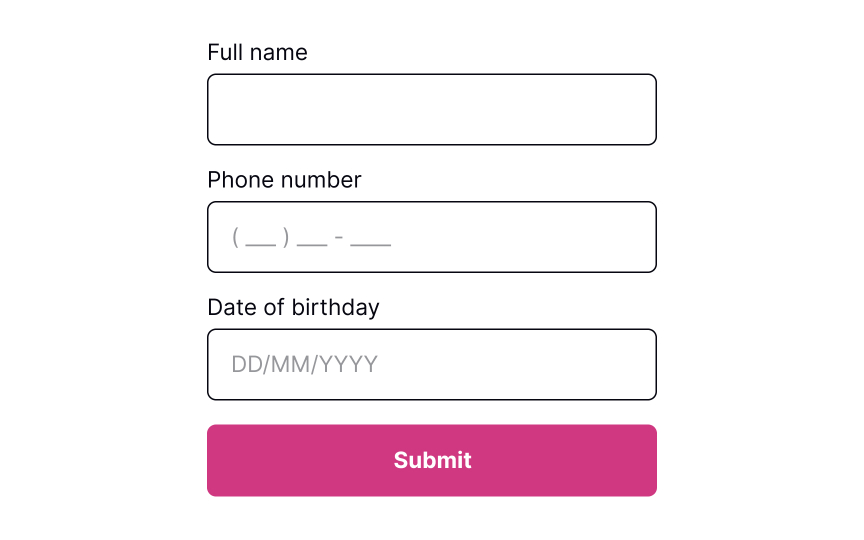
- Using forgiving formats: Rather than forcing users to type in a format desired for your system, allow them to type in a way that’s convenient to them. Then, format their input while users are typing and add necessary spaces, parentheses, or hyphens, removing letters if it’s a phone number input, for example.
- Reducing cognitive load: Don’t force users to keep too many things in mind. For example, it’s a good practice to detect the SMS passcode from their messages and display it above the keyboard. This way, users don’t need to switch between screens and strain their memory.[1]
- Providing clear instructions: Users don’t like reading and prefer skimming information. So make sure labels, tooltips, and form instructions are concise and straight to the point.
SaveShare
Keep the input in default state
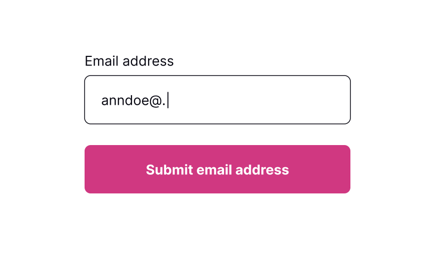
Error inputs should be easy to notice — this supports Nielsen’s “visibility of system status” heuristic. However, users should notice them only after they enter any data. Ideally, input validation should happen inline. It means the input should be checked for errors only after users enter information and can afford to focus away from the input.
Pro Tip! Use inline validation to indicate successful entries. It’ll remove any second-guessing that users may have to do when filling in a complex form with multiple inputs. SaveShare
Allow users to enter information
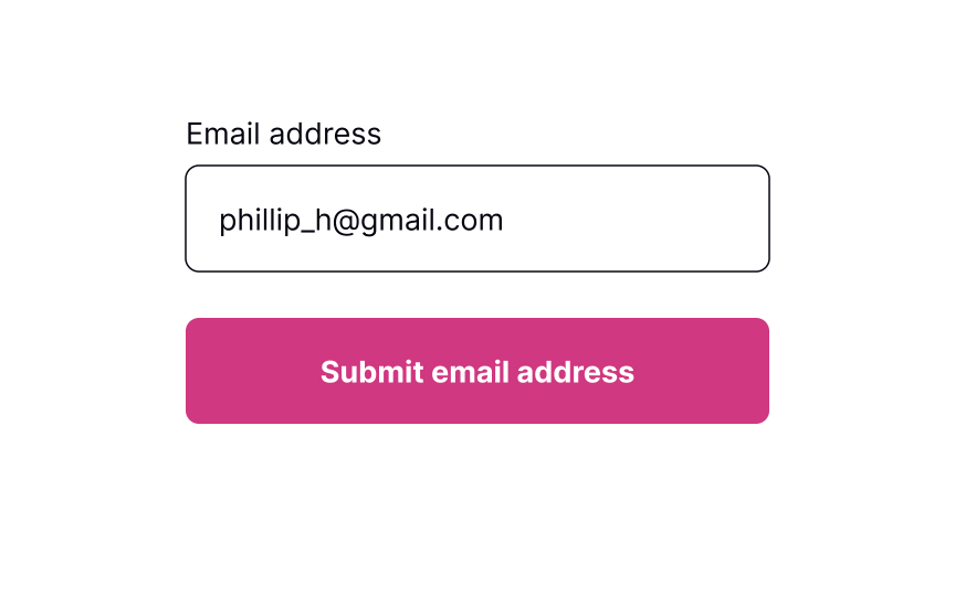
While users are filling out a form, they may want to edit some information and go back to previous fields. Let them type without interruption and don’t check for errors until users finish making changes and shift their focus from the input. Otherwise, you might distract users and make them doubt whether they’ve already made a mistake.
Inline validation makes sense for complex inputs such as new passwords, as it helps prevent guessing or double-checking whether the information they entered meets the requirements..[2] SaveShare
Provide input masks to avoid errors
Placeholders are supposed to clarify what information users need to enter and increase the form completion speed. Unfortunately, many people confuse placeholders with real data filled in by default.
Plus, if placeholders substitute labels, they disappear after users place the cursor in the input. If they get distracted at this time, they will need to shift their focus away from the input to display the placeholder text again.[3] If placeholders are so tricky, how can we use them to help users prevent errors?
Input masks are an excellent solution when formatting matters (for things like phone numbers or dates). Besides displaying the desired input format, they also automatically apply it to users’ input as they type. This tool reduces cognitive load and confusion, so users don’t need to worry and double-check if they have typed everything correctly.SaveShare
Signal error after loss of focus
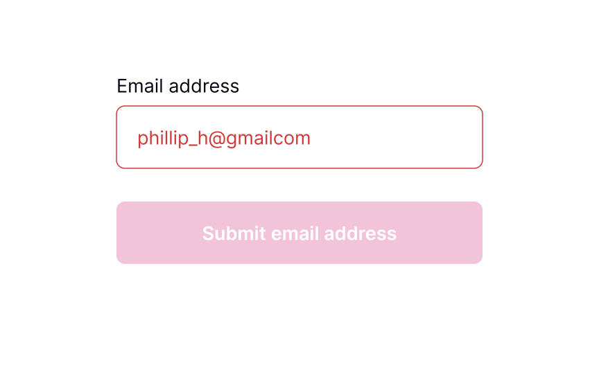
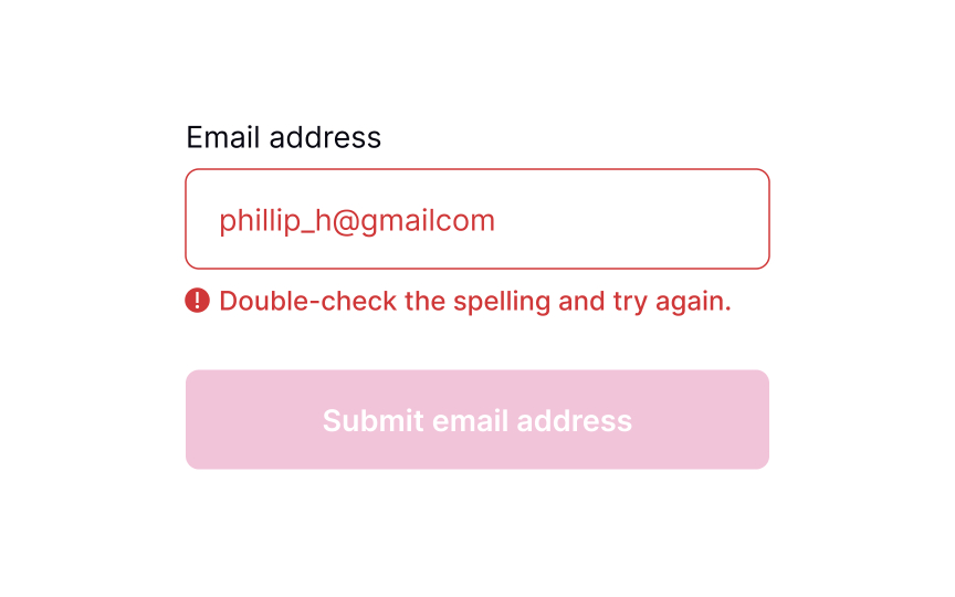
Once users move away from the input field by selecting another element or removing the cursor, the system can begin validating the input. In case an error occurs, display a message next to the input and explain how users can correct it. Make sure the message is clear and polite and provides straightforward instructions using plain language.
Pro Tip! From an accessibility viewpoint, it’s important to accompany the error message with an icon indicating an error. SaveShare
Meaningful error messages

Even if you take all measures to prevent input errors, users will make them anyway. Providing meaningful error messages reassures users that mistakes happen and that it isn’t the end of the world.
- Use plain language: Get rid of technical jargon and passive voices, which may confuse users.
- Keep the message short: Users don’t like to read, and in the face of a stressful environment, they are even less likely to read something longer than 1-2 sentences. A study by the American Press Institute shows that users are more likely to understand the whole piece of information only if the sentence contains no more than 8 words.[4]
- Be precise: Avoid ambiguous phrases like “an error occurred,” as they don’t help users identify the root cause. Tell them which input contains the error and what they are expected to enter in order to solve it.
- Be polite: Avoid blaming users or making them feel stupid. Focus on fixing the problem and building trust and loyalty.
SaveShare
Keep the error state visible till fixed
Keeping the error state visible while the user is making corrections is important because:
- It maintains context about what needs to be fixed
- Users don’t have to remember what the error was
- It provides immediate feedback as they work toward a solution
- It prevents confusion about whether the error has actually been resolved
The field should only return to its default or success state when the input actually becomes valid, not just when the user starts typing again. For example, if a password is too short, the error state and message should persist until the password reaches the minimum length requirement.
The only visual change during user input should be real-time validation feedback, like checkmarks appearing next to requirements as they’re met.
Showing Input Error
Delve into the principles of providing clear and informative input error messages that guide users toward resolving the issue
Interaction Design
7 exercises

Start +250px
Users mistype all the time — whether it’s a finger slipping or rushing through letters, errors happen. Since it is an everyday occurrence, solving an error should be obvious and seamless.
One of Nielsen’s heuristics states that a good system should help users recognize and recover from errors. What can designers do to enforce this?
- Provide strong visuals to indicate the problem clearly.
- Use simple and straightforward language to explain the cause of the problem and guide further steps.
Good error messages shouldn’t just inform users of a problem. They should make it clear how to fix the issue and move forward effectively.
Prevent errors from the start
In the ideal world, users never make mistakes and complete tasks successfully every time. Unfortunately, in the real world, systems can be confusing, users may get distracted or lose attention, and errors happen.
Error-prevention strategies for inputs include:
- Using constraints: Constraints prevent users from typing a wrong input by setting boundaries. For example, inputs asking for users’ phone numbers or banking card numbers should show a numeric keyboard only.
- Using forgiving formats: Rather than forcing users to type in a format desired for your system, allow them to type in a way that’s convenient to them. Then, format their input while users are typing and add necessary spaces, parentheses, or hyphens, removing letters if it’s a phone number input, for example.
- Reducing cognitive load: Don’t force users to keep too many things in mind. For example, it’s a good practice to detect the SMS passcode from their messages and display it above the keyboard. This way, users don’t need to switch between screens and strain their memory.[1]
- Providing clear instructions: Users don’t like reading and prefer skimming information. So make sure labels, tooltips, and form instructions are concise and straight to the point.
SaveShare
Keep the input in default state
Error inputs should be easy to notice — this supports Nielsen’s “visibility of system status” heuristic. However, users should notice them only after they enter any data. Ideally, input validation should happen inline. It means the input should be checked for errors only after users enter information and can afford to focus away from the input.
Pro Tip! Use inline validation to indicate successful entries. It’ll remove any second-guessing that users may have to do when filling in a complex form with multiple inputs. SaveShare
Allow users to enter information
While users are filling out a form, they may want to edit some information and go back to previous fields. Let them type without interruption and don’t check for errors until users finish making changes and shift their focus from the input. Otherwise, you might distract users and make them doubt whether they’ve already made a mistake.
Inline validation makes sense for complex inputs such as new passwords, as it helps prevent guessing or double-checking whether the information they entered meets the requirements..[2] SaveShare
Provide input masks to avoid errors
Placeholders are supposed to clarify what information users need to enter and increase the form completion speed. Unfortunately, many people confuse placeholders with real data filled in by default.
Plus, if placeholders substitute labels, they disappear after users place the cursor in the input. If they get distracted at this time, they will need to shift their focus away from the input to display the placeholder text again.[3] If placeholders are so tricky, how can we use them to help users prevent errors?
Input masks are an excellent solution when formatting matters (for things like phone numbers or dates). Besides displaying the desired input format, they also automatically apply it to users’ input as they type. This tool reduces cognitive load and confusion, so users don’t need to worry and double-check if they have typed everything correctly.SaveShare
Signal error after loss of focus
Once users move away from the input field by selecting another element or removing the cursor, the system can begin validating the input. In case an error occurs, display a message next to the input and explain how users can correct it. Make sure the message is clear and polite and provides straightforward instructions using plain language.
Pro Tip! From an accessibility viewpoint, it’s important to accompany the error message with an icon indicating an error. SaveShare
Meaningful error messages
Even if you take all measures to prevent input errors, users will make them anyway. Providing meaningful error messages reassures users that mistakes happen and that it isn’t the end of the world.
- Use plain language: Get rid of technical jargon and passive voices, which may confuse users.
- Keep the message short: Users don’t like to read, and in the face of a stressful environment, they are even less likely to read something longer than 1-2 sentences. A study by the American Press Institute shows that users are more likely to understand the whole piece of information only if the sentence contains no more than 8 words.[4]
- Be precise: Avoid ambiguous phrases like “an error occurred,” as they don’t help users identify the root cause. Tell them which input contains the error and what they are expected to enter in order to solve it.
- Be polite: Avoid blaming users or making them feel stupid. Focus on fixing the problem and building trust and loyalty.
SaveShare
Keep the error state visible till fixed
Keeping the error state visible while the user is making corrections is important because:
- It maintains context about what needs to be fixed
- Users don’t have to remember what the error was
- It provides immediate feedback as they work toward a solution
- It prevents confusion about whether the error has actually been resolved
The field should only return to its default or success state when the input actually becomes valid, not just when the user starts typing again. For example, if a password is too short, the error state and message should persist until the password reaches the minimum length requirement.
The only visual change during user input should be real-time validation feedback, like checkmarks appearing next to requirements as they’re met.
Entering a Promo Code
Explore the best practices for promoting and applying promo codes to create a seamless and enjoyable experience for users
Interaction Design
7 exercises

Start +250px
Whether promo codes come from a seasonal sale or a coupon, who doesn’t love getting a discount? However, if you want your users to genuinely enjoy this reward, you should provide a smooth experience of noticing promotions and applying them. To avoid confused customers, make sure they understand how to use the coupon and what is happening with it — whether it works, is expired, or isn’t applicable.
Make promo code element visible
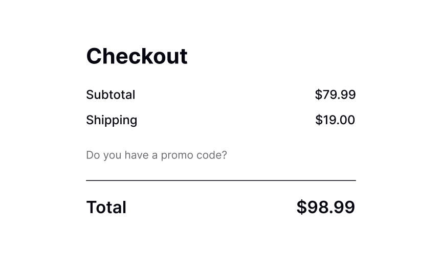
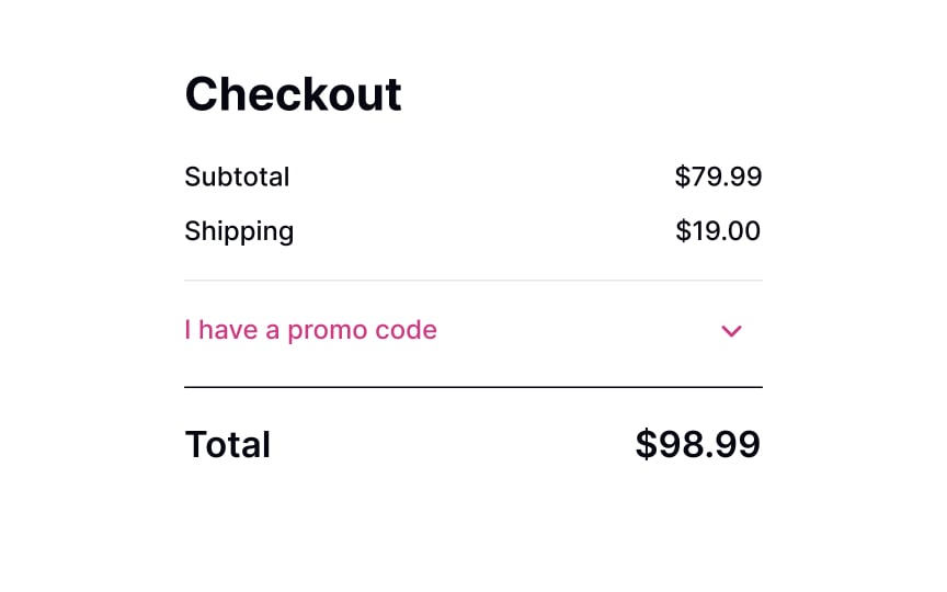
The cart or checkout pages are expected to have a promo code input.
A blank promo code/coupon box with a large Apply button can be quite confusing, making users wonder whether they should search for a code and potentially lead to lost conversions.[1]
However, users should notice this element without extra effort when scanning a page. Displaying a noticeable link allows designers to kill two birds with one stone. Firstly, it’s easy to spot. Secondly, it only expands into an input on click and doesn’t distract users who don’t have a code or aren’t interested in promotions.SaveShare
Allow promo codes to be applied with a click
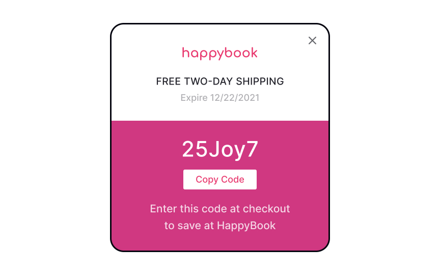
When you offer users a promo code on a website or advertisements, allow them to apply the promo with a click rather than having to enter the code manually. It’ll notably reduce user efforts, as they won’t need to strain their memory to remember the code if it’s embedded into an image that can’t be copied.
Another option is to offer a selection of available promo codes during checkout. Once they find the right deal, users can click the code and apply it automatically to the order without unnecessary worries.[2]SaveShare
Apply global promos automatically

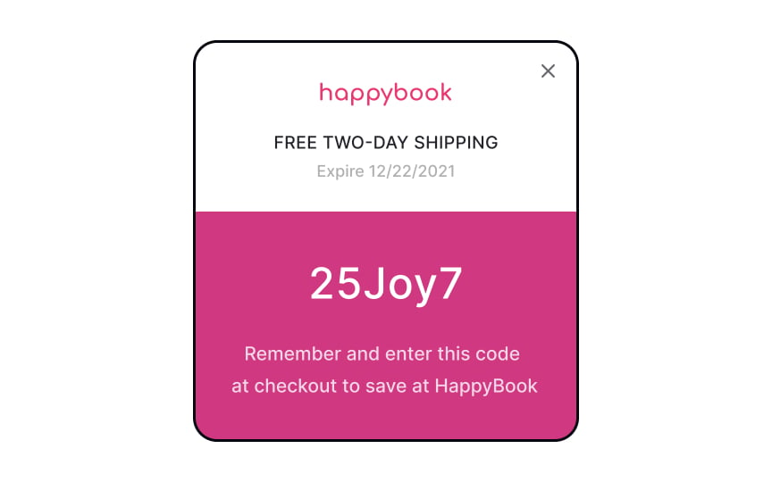
Sometimes, websites can offer promo codes for certain actions such as signing up for a mailing list or making an order for a specific price total. Don’t ask users to make an extra effort – automatically apply such coupon codes to the shopping cart.
You can also send users an email notifying them that they’ve been granted a promo code. Make sure users can copy or apply the coupon directly from the email and are redirected to a page where the code is already applied to their order.SaveShare
Promo code applied successfully
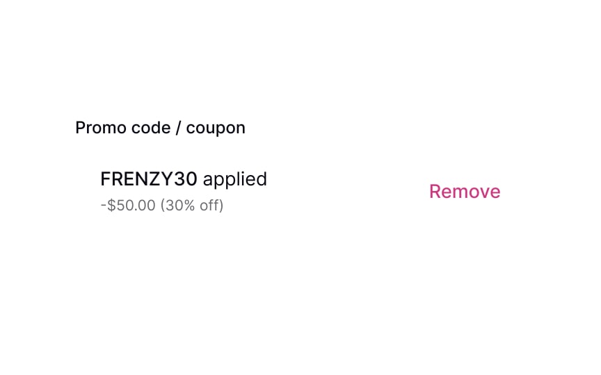
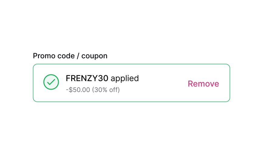
When a user successfully applies a promo code, it’s important to confirm it immediately. This can be achieved by using success state colors (such as green), an icon, or explanatory text. These visual cues will help users feel assured that their coupon is valid and that a discount will be applied to their order.
By keeping users informed throughout the process, you can enhance their confidence in your website or app, and make them more likely to complete their purchase.SaveShare
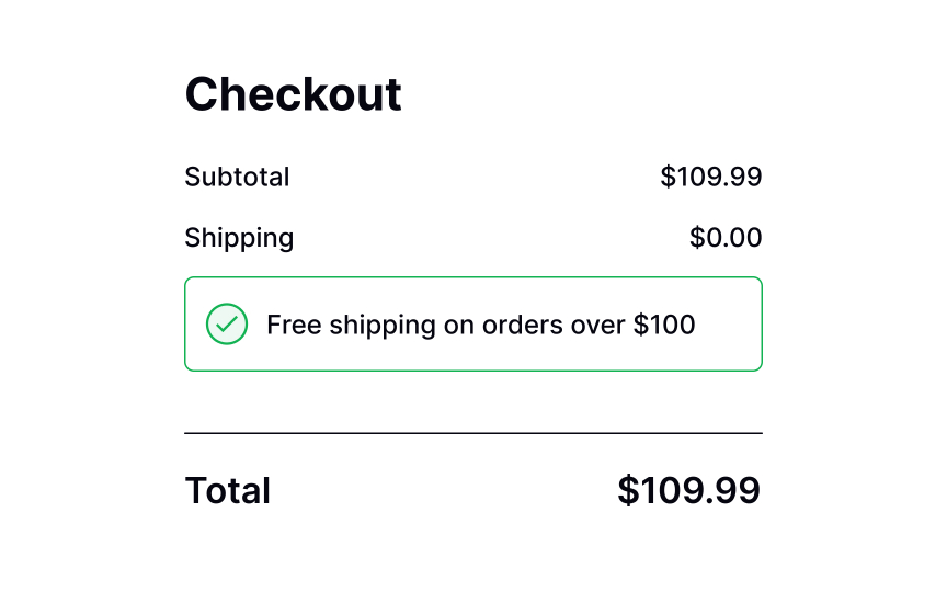
Reflect the discount in the total
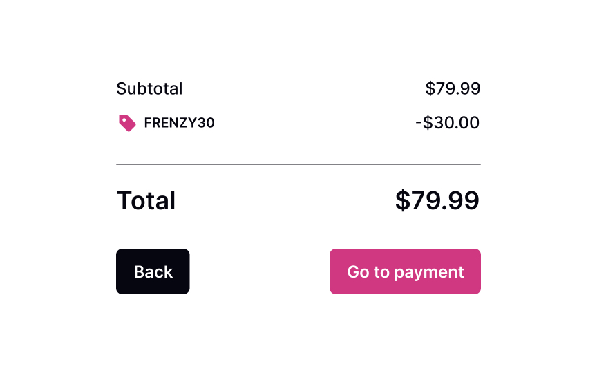
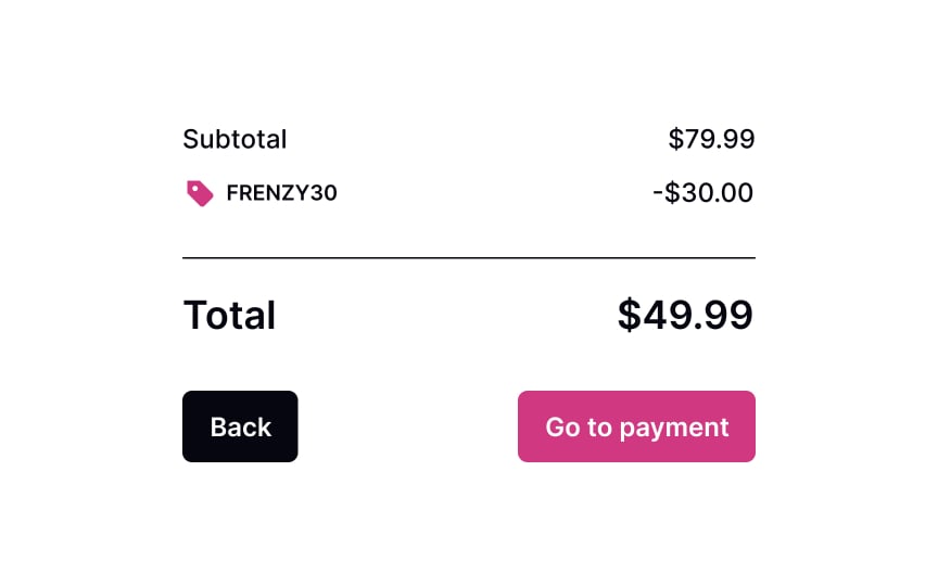
There’s no point in promo codes if users don’t see the discount applied and the price reduced. Before users proceed with the checkout, make sure the system applied the coupons, registered the discount, and recalculated the total correctly. It’s important to also show the discount near the total at checkout.SaveShare
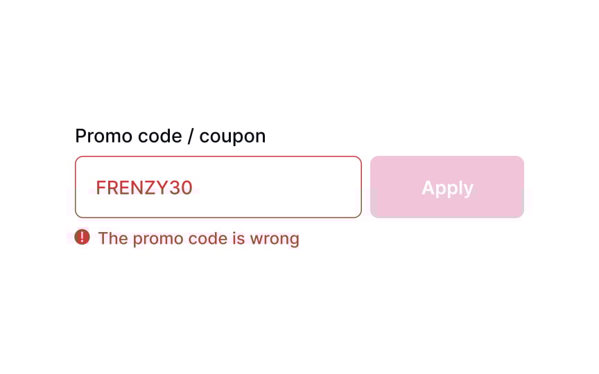
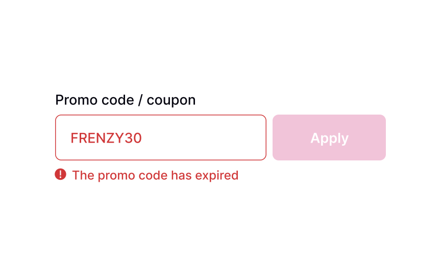
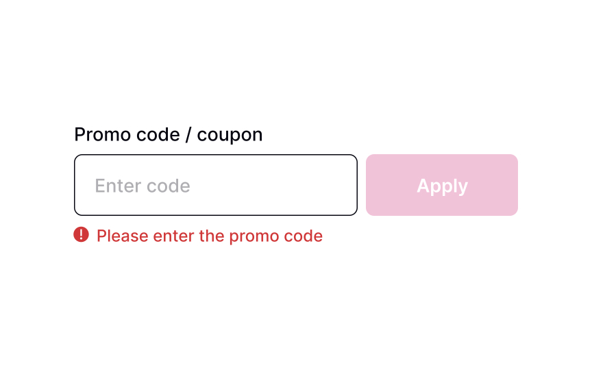
Promo code error
In some cases, the promo code may not be applicable. In other cases, it could have expired or have been entered incorrectly. Let users know about it by providing an explicit error message, including constructive advice on what users can do about it. If the promo code has expired, you can provide a link where users can browse through the list of other available coupons. If the promo code contains an error, suggest that users check and reapply it.SaveShare
Remove promo code
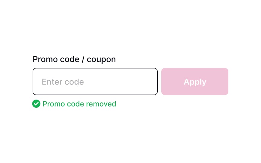
In some cases, users might not like the discount offered. They may prefer the original sale price of an item or could have found a better promo code to use. When they remove a code from the input, provide a concise message informing users about it. It will eliminate any confusion regarding whether or not the total includes any discounts.
Saving Changes
Learn about different methods and techniques for conveying system feedback to users
Interaction Design
7 exercises

Start +250px
Users often need to change their details, either to update their email address, fix a typo in their name, or add a payment method. It’s important to let them know what’s going on at any point in their interaction with the system while they do so. Showing system feedback informs users that their work is saved and makes them feel in control. Seeing that changes have been accepted also gives them a sense of accomplishment.
Methods you use to inform users about what’s happening in the system can depend on the stage of the process. The action button states, loaders, toast notifications, and banners are the most common ways to do that.
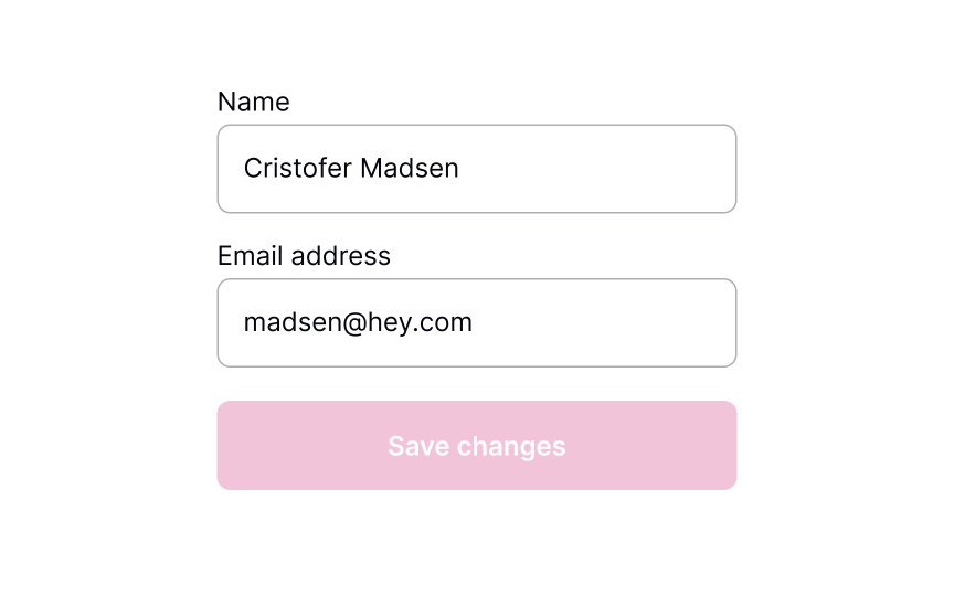
Show the action to save changes
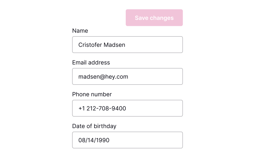
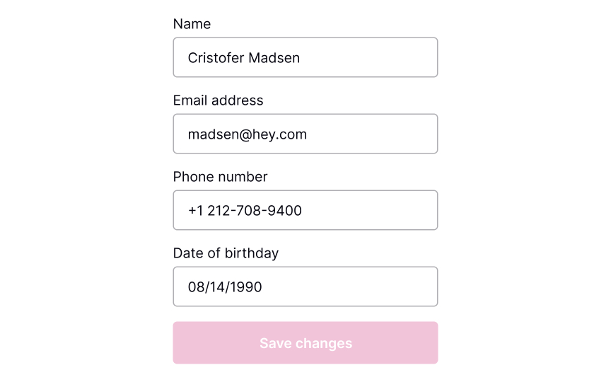
Buttons are the most common tool to confirm and save changes. Make sure they’re highly visible.
Where should the Save Changes button be placed? As users scan the content, their eyes move from the top half of the screen toward the bottom. When the content ends, they look for a call to action — so place the CTA button at the end of the content.
For browsers, make sure that the button is above the fold. Another option is to place the button right below the end of all the editable content. In apps, you can make the button stick to the bottom of the screen so that it’s always visible.[1]SaveShare
Switch to active state once a change is made
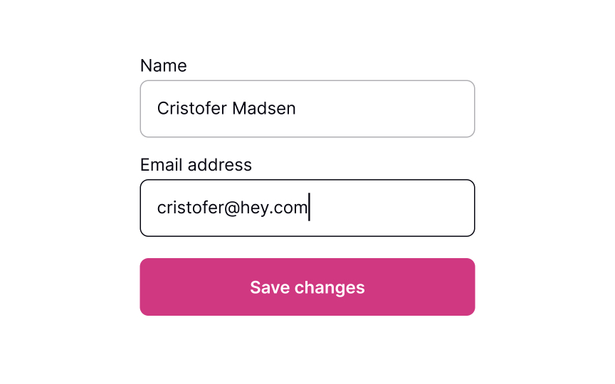
Users who understand what’s going on in the system feel more confident and trust it more.[2] This is especially important while they’re making changes.
The state of the Save Changes button is a good way to communicate system feedback. Display the button as disabled before changes are applied. When information is modified, change the button state to active in order to bring it to users’ attention. This will communicate to them that changes have been made and are waiting to be saved.SaveShare
Action changes to loading state when pressed
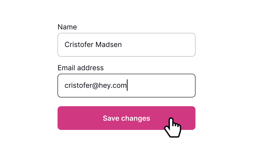
Keep users in the loop about what’s going on in the system. After users change their information and press the Save Changes button, show that saving is in progress. This communicates that the interaction was successful, and users didn’t waste their time.
A common way to show that changes are being saved is by using a loader — either as a CTA button state or a full-screen one. If the process takes a while, add a message stating so or some tips and fun facts to make the wait less boring.SaveShare
Notify that changes have been saved
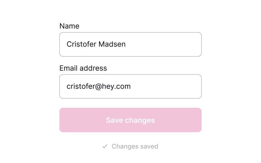
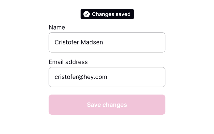
Once the system has saved the changes, the page will reload or update. Informing users about this ensures that they know their work wasn’t lost. Use a success toast notification or banner that disappears after a while to inform users that changes have been saved. These can include an Undo functionality which is great for reversible actions or actions with minor consequences.[3]
Success messages should be visible but not intrusive. In the message, be sure to include a short description of what has happened.SaveShare
Add two-step verification when changing sensitive information
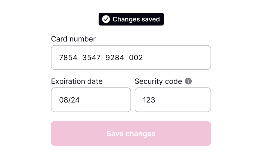
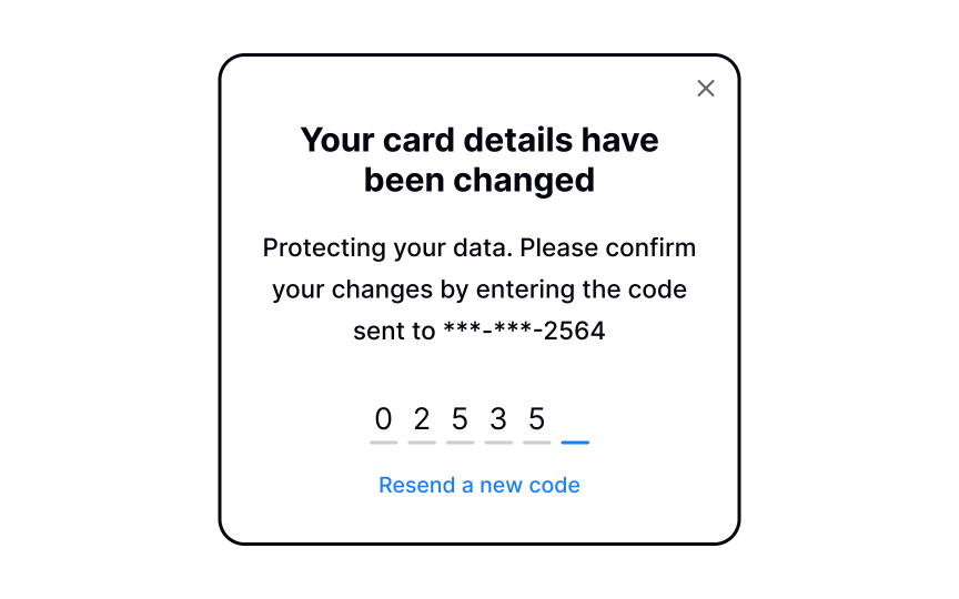
If your product requires users to share sensitive information — like their credit card details — it most likely already has two-factor authentication. It’s a security process in which users need to verify themselves twice, most commonly with:
- A login and password
- A security token (e.g., one-time passwords)
- A biometric factor (a fingerprint or facial scan)[4]
Consider adding two-factor verification when changing important information, such as an email address, billing info, etc. This will ensure that users can avoid any unauthorized or accidental changes.SaveShare
When to autosave
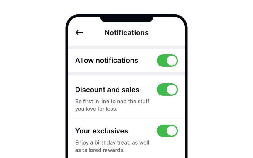
Autosave is becoming more of a common practice within applications. If done correctly, it can improve the user experience.
The most common use cases for this are settings that are easy to revert, such as toggles and checkboxes. This way, users can just change one setting without reviewing all of them. It also feels intuitive — we expect the setting to work as soon as we flick the switch, the same as when we turn on a light. Even if you enable autosave, allow users to also save changes manually with the Save Changes button.
Pro Tip! When considering autosave, analyze the platform your target audience uses. For example, macOS users are used to autosaving while Windows users aren’t.SaveShare
Canceling or reverting changes
Allow users to leave without making changes. Most users expect the changes not to be saved when they close the window or press the Back button, so avoid tying autosaving to these functions.
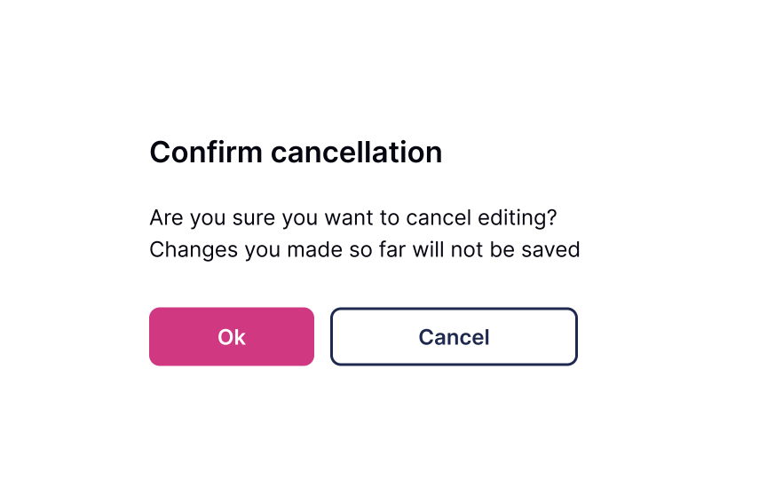
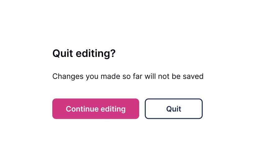
You can use a confirmation dialogue when users modify important information such as an email address or phone number without saving it. Make sure that the dialogue is short and straightforward. The headline should ask, or inform, about one main action we’d like to reconfirm. Avoid generic headlines for confirmation dialogues like “Warning” or “Are you sure.”
Use unambiguous CTA buttons. The word Cancel isn’t great when related to deleting or removing, as it’s not clear what is canceled — the action or the cancellation of the action. Better options include Back, Stay, No, Leave, Quit, or any other action word that is instinctively clear in context.
Canceling Subscription
Explore the importance of providing a graceful exit for users who decide to cancel their accounts or stop using your product or service
Abreakup is never something you look forward to or enjoy. Similar to closing an account, users can decide to end their experience and stop paying for your product. Well, users leave, but it’s not a tragedy, and it doesn’t mean you can’t give them a graceful exit. It’s important to make a cancellation obvious to find and easy to travel through. Remember, a decent and polite goodbye can set the stage for users to come back in the future.
Besides, it’s a great opportunity to receive users’ feedback and use it for product improvement.
Make the Unsubscribe button easy to locate
When users decide to cancel their membership, they should know where to find the right link or button without having to do extra guesswork. Usually, designers place it in the account’s settings or billing sections.
Users have expectations of how this link or section should look, so make sure:
- It’s easy to notice
- It looks clickable/tappable
- Use the appropriate labels like Unsubscribe or Cancel/Manage Subscription
Hiding the Unsubscribe button can lead to low loyalty and brand mistrust. Be honest and respectful, allowing users to decide for themselves whether they want to use your product or want to stop using it forever or temporarily.SaveShare
Confirm intent to cancel
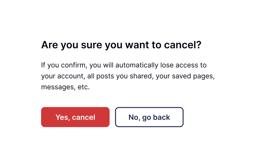
Sometimes, users may accidentally click the destructive button that triggers the removal of an account or subscription. So prevent irretrievable actions by asking users to confirm their choice. Plus, it’s an additional opportunity to try and reel users back by pointing out what they’ll lose when they cancel the subscription. For example, if users can access the product only with a subscription, you can remind them of the product’s value.
Conversely, if the product can be accessed in a free version, you can remind users of some specific subscription benefits. The golden rule here is to avoid using language that begs for sympathy or exploits tools of pressure or manipulation.SaveShare
Request a reason for canceling
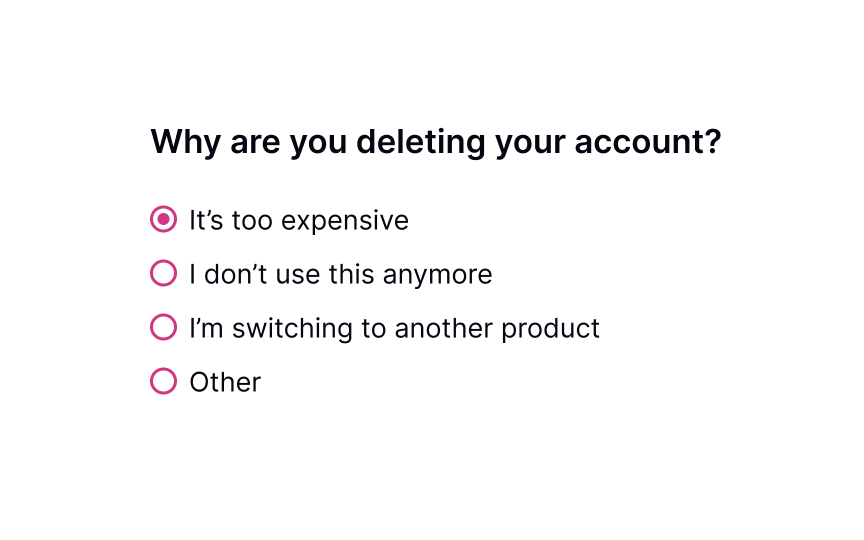
When users decide to cancel their subscription, it’s a great opportunity to receive feedback and learn what can be improved. Was the product too expensive? Did users prefer a competitor? Did they get what they needed and no longer need the service?
Don’t make this question mandatory and avoid pressing users to provide a detailed answer. Be polite and provide possible options for why users may want to leave. Additionally, include a section labeled “Other” that allows users to provide their own reasons for leaving in an open-ended format.
Pro Tip! If users abandon your product for the same reason, you should reconsider your pricing plans, user experience in general, or whatever most commonly makes them leave.SaveShare
Offer incentives for continuing
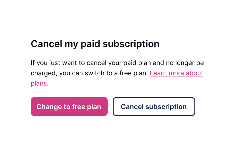
Sometimes, even loyal users want to leave. Don’t let them go by offering attractive incentives that might make users reconsider their decision to cancel. It could be a temporary discount or a free upgrade to their current plan.
If you figure that users may have some financial issues, it’s worth mentioning that they could opt to downgrade a subscription instead of canceling it entirely. Be friendly, polite, and don’t pressure users to stay, no matter what. Your task is just to make sure they’ve considered all options.SaveShare
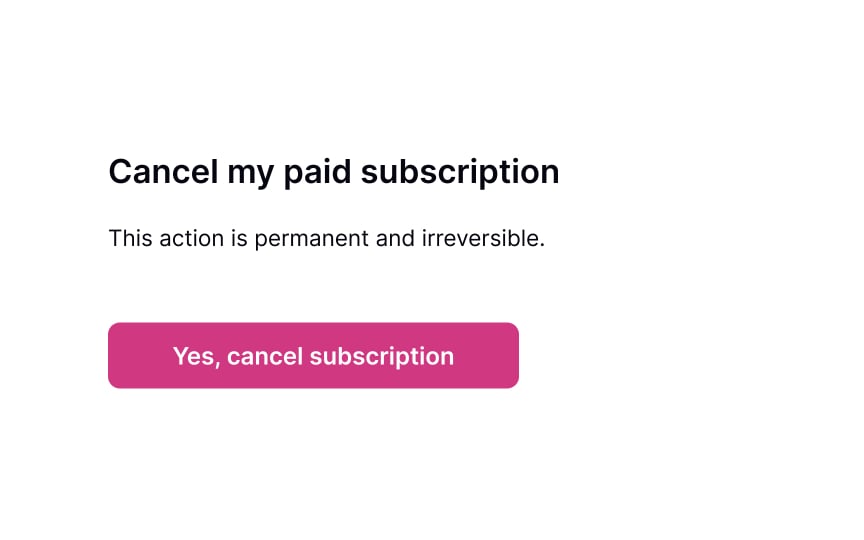
Confirm cancellation of subscription
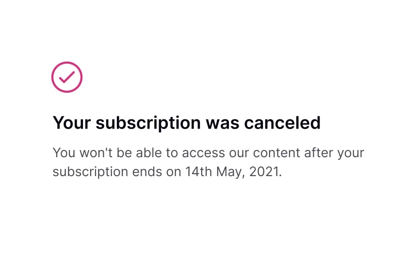
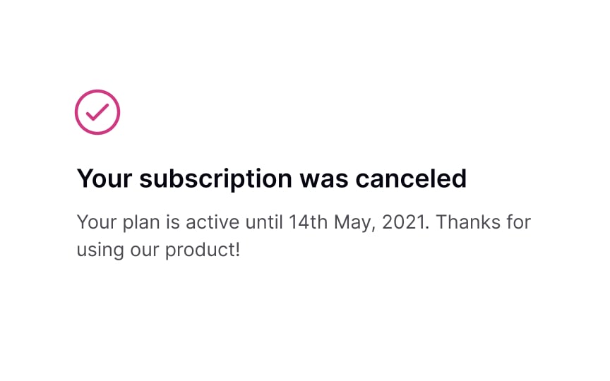
Once users cancel their subscription, they may still want to continue using it until it’s active. The confirmation page is an excellent opportunity to explain how long users can use the membership after cancellation and what they can do if they decide to renew it in the future. SaveShare
Follow-up via email
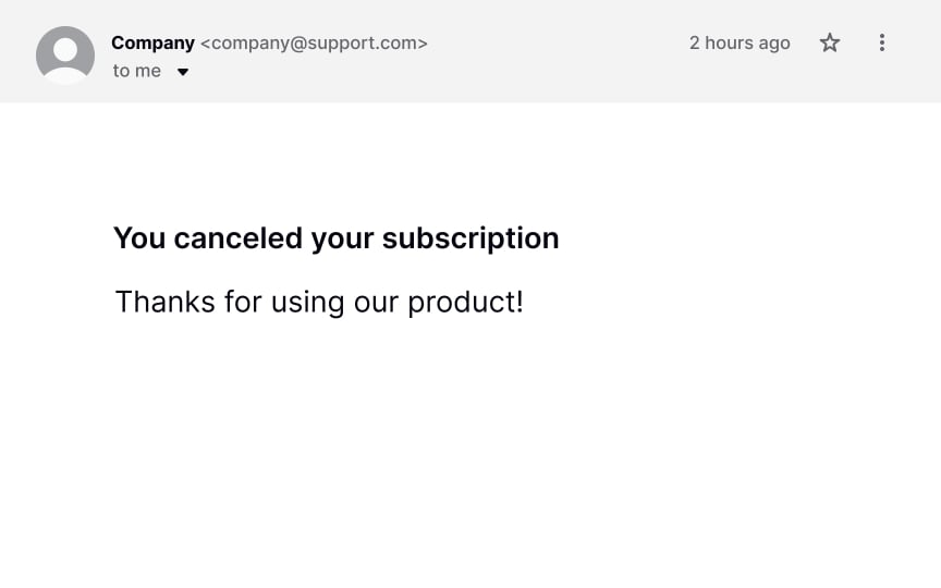
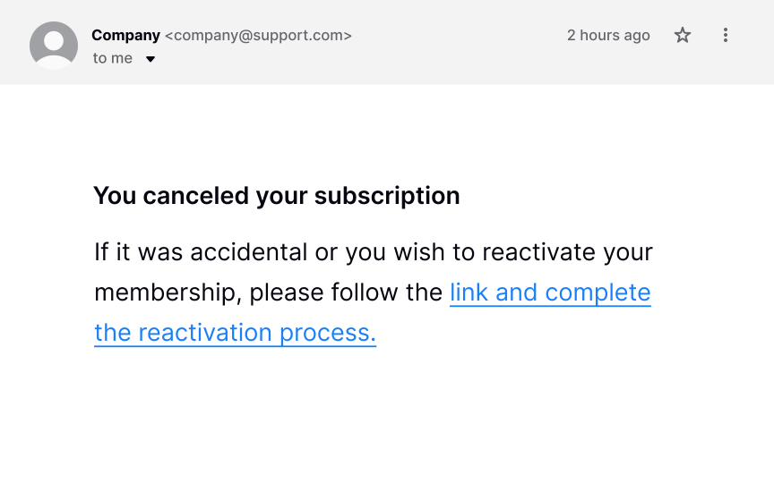
Mistakes happen, and users may accidentally click the Cancel button. Or, they may consciously cancel their subscription and then simply change their mind. Having an “emergency exit” and the undo option makes users feel in control of the system, fostering a sense of freedom and confidence.[1]
Make sure users always have a chance to revert changes and keep their membership. First, show a confirmation dialog asking users to confirm that they want to cancel the subscription permanently. Second, send them a follow-up email with a reactivation link after the cancellation. Some users will be grateful for this opportunity to undo the destructive action.